<section xml:id="section-side-by-side" label="section-side-by-side">
<title>Side-By-Side Panels</title>
<introduction>
<title>Introduction</title>
<p>
The flow of a page is almost universally top-to-bottom.
But at times you would like to go <em>across</em> a page, perhaps to compare items (identical content in two different languages), or to make good use of a page real estate by grouping several small items together (<eg/> images).
So the <tag>sidebyside</tag> tag is strictly a layout device, though it does convey some meaning by grouping certain objects together.
A variety of different objects can be put side-by-side using the <c>sidebyside</c> element.
Specifically, <c>figure</c>, <c>image</c>, <c>tabular</c>, <c>p</c>, <c>ol</c>, <c>ul</c>, <c>dl</c>, <c>pre</c>, <c>poem</c>, and more.
The individual components of a <tag>sidebyside</tag> are generically called <term>panels</term><idx>panels</idx>.
</p>
<p>
As a layout device, the <tag>sidebyside</tag> does not allow a <tag>caption</tag>, is never numbered, and therefore cannot be cross-referenced.
You may cross-reference whatever element holds the <tag>sidebyside</tag>, and many of the panels may be cross-referenced individually.
</p>
<p>
As a first example, we have two single paragraphs, laid out with different widths, and slight margins on each side.
The widths have been chosen experimentally to get roughly identical heights for the two paragraphs of varying length.
</p>
<sidebyside widths="60% 31%" margins="3%">
<p>
Lorem ipsum dolor sit amet, consectetur adipiscing elit.
Proin lorem diam, convallis in nulla sed, accumsan fermentum urna.
Pellentesque aliquet leo elit, ut consequat nunc dapibus ac.
Sed lobortis leo tincidunt, vulputate nunc at, ultricies leo.
Vivamus purus diam, tristique laoreet purus eget, mollis gravida sapien.
Nunc vulputate nisl ac mauris hendrerit cursus.
Sed vel molestie velit.
Suspendisse sem sem, elementum at vehicula id, volutpat ac mi.
Nullam ullamcorper fringilla purus in accumsan.
Mauris at nunc accumsan orci dictum vulputate id id augue.
Suspendisse at dignissim elit, non euismod nunc.
Aliquam faucibus magna ac molestie semper.
Aliquam hendrerit sem sit amet metus congue tempor.
Donec laoreet laoreet metus, id interdum purus mattis vulputate.
Proin condimentum vitae erat varius mollis.
Donec venenatis libero sed turpis pretium tempor.
</p>
<p>
Praesent rutrum scelerisque felis sit amet adipiscing.
Phasellus in mollis velit.
Nunc malesuada felis sit amet massa cursus, eget elementum neque viverra.
Integer sagittis dictum turpis vel aliquet.
Fusce ut suscipit dolor, nec tristique nisl.
Aenean luctus, leo et ornare fermentum, nibh dui vulputate leo, nec tincidunt augue ipsum sed odio.
Nunc non erat sollicitudin, iaculis eros consequat, dapibus eros.
</p>
</sidebyside>
</introduction>
<subsection>

  <title>Figures with Numbers Side-By-Side</title>

  <p>
    Figures, or other captioned items such as tables or listings, can be placed side-by-side using the <c>sidebyside</c> element.
    The figures will be captioned and numbered as if they were part of the vertical flow of the document.
    For example, see <xref ref="regular-figure"/> and <xref ref="another-regular-figure"/>
  </p>

  <p>
    However, if the <tag>sidebyside</tag> is placed inside another <tag>figure</tag>, then the outer figure gets an overall caption and a <q>regular</q> number, while the captions of the interior items will be labelled as (a), (b), (c), etc; for example, see the subfigures in <xref ref="fig-sidebyside-global"/>.
    You can also cross-reference the subfigures individually, for example: <xref ref="fig-sidebyside-subfigure"/>.
  </p>

  <p>
    The <c>sidebyside</c> tag can have an attribute <c>widths</c> that specifies a percentage width of the page for each panel of the layout.
    There are automatic margins by default, and any remaining width is divided evenly to space out the panels.
    When the <c>margins</c> attribute is given as <c>auto</c>, or in the default case, the margins provided each equal half of the inter-panel space.
  </p>

  <p>
    With no attributes on the <c>sidebyside</c>, each panel is the same width and there is no inter-panel space and no margin.
    For a <c>sidebyside</c> with a single panel, with its width specified, the panel will be centered.
  </p>

  <figure xml:id="fig-sidebyside-global">

    <caption>Side-by-Side, with figures as children, automatic margin</caption>

    <sidebyside widths="25.67% 25%">

      <figure xml:id="fig-sidebyside-subfigure">

        <caption/>

        <image source="images/cross-square.png">

          <shortdescription>
            a white square outlined in blue covered by a black X
          </shortdescription>

        </image>

      </figure>

      <figure>

        <caption/>

        <image source="images/cross-square.png"/>

        </figure>

      </sidebyside>

    </figure>

    <figure>

      <caption>Side-by-Side, with figures as children, margin set to zero</caption>

      <sidebyside widths="50% 25%" margins="0%">

        <figure>

          <caption>width=50%</caption>

          <image source="images/cross-square.png"/>

          </figure>

          <figure>

            <caption>width=25%</caption>

            <!-- a comment in a location like this once revealed a bug --> <image source="images/cross-square.png"/>

          </figure>

        </sidebyside>

      </figure>

      <figure>

        <caption>Widths calculated automatically, all defaults</caption>

        <sidebyside>

          <figure>

            <caption/>

            <image source="images/cross-square.png"/>

            </figure>

            <figure>

              <caption/>

              <image source="images/cross-square.png"/>

              </figure>

              <figure>

                <caption/>

                <image source="images/cross-square.png"/>

                </figure>

              </sidebyside>

            </figure>

            <sidebyside widths="25% 25% 50%">

              <figure xml:id="regular-figure">

                <caption>Interior figure</caption>

                <image source="images/cross-square.png"/>

                </figure>

                <figure xml:id="another-regular-figure">

                  <caption>Regular numbering</caption>

                  <image source="images/cross-square.png"/>

                  </figure>

                  <figure xml:id="yet-another-regular-figure">

                    <caption>Regular numbering</caption>

                    <image source="images/cross-square.png"/>

                    </figure>

                  </sidebyside>

                </subsection>
<subsection>
<title>Images</title>
<p>
We can use the <c>sidebyside</c> element to put <c>images</c><idx>image</idx>
next to each other.
These will illustrate a text, but with no captions or numbers, cannot be cross-referenced.
This next example has <c>10%</c> margins, and the panels have widths <c>25%</c> and <c>40%</c>, leaving <c>15%</c> computed as the one inter-panel space.
</p>
<sidebyside widths="25% 40%" margins="10%">
<image source="images/cross-square.png"/> <image source="images/cross-square.png"/>
</sidebyside>
<p>
Now we fine-tune with different widths (which add up to 100%).
The five images have been given different vertical alignments, <c>top middle bottom top middle</c> via the <c>valigns</c> attribute.
</p>
<sidebyside widths="10% 30% 20% 20% 20%" margins="0%" valigns="top middle bottom top middle">
<image source="images/cross-square.png"/> <image source="images/cross-square.png"/> <image source="images/cross-square.png"/> <image source="images/cross-square.png"/> <image source="images/cross-square.png"/>
</sidebyside>
<p>
If you want an overall caption to a group of images, but no sub-captions on your images, that is also straightforward.
This example has no attributes specified.
The overall <tag>figure</tag> may be cross-referenced, as <xref ref="figure-double-image"/>
</p>
<figure xml:id="figure-double-image">
<caption>Two equally-spaced (identical) images</caption>
<sidebyside>
<image source="images/cross-square.png"/> <image source="images/cross-square.png"/>
</sidebyside>
</figure>
</subsection>
<subsection>
<title>Common Side-By-Side Constructions</title>
<p>
We have now seen at least one example of each of the four most common constructions involving <c>sidebyside</c>.
Working from the exterior inward, we can go <c>figure</c>, <c>sidebyside</c>, <c>figure</c>, <c>X</c>, where <c>X</c> is some atomic (unnumbered) item we might use elsewhere in a <pretext/> document, the inner <c>figure</c> may be repeated with different objects <c>X</c>, and the <c>figure</c>s have captions.
Each <c>figure</c> is independently optional, leading to the four combinations in this table.
Note this applies to any captioned item used inside the <c>sidebyside</c>, but a <c>figure</c> is the most flexible.
</p>
<table>
<title><c>sidebyside</c> and <c>figure</c> interactions</title>
<tabular>
<row bottom="major">
<cell>Outer Figure</cell>
<cell>Inner Figure</cell>
<cell>Effect</cell>
</row>
<row>
<cell>Absent</cell>
<cell>Absent</cell>
<cell>Layout only, no numbers nor captions</cell>
</row>
<row>
<cell>Absent</cell>
<cell>Present</cell>
<cell>Numbers and captions on figure(s)</cell>
</row>
<row>
<cell>Present</cell>
<cell>Absent</cell>
<cell>Number and overall caption</cell>
</row>
<row valign="top">
<cell>Present</cell>
<cell>Present</cell>
<cell><line>Number and overall caption,</line>
<line>sub-numbers and captions on figure(s)</line>
</cell>
</row>
</tabular>
</table>
</subsection>
<subsection>
<title>Vertical Alignment</title>
<p>
Vertical alignment can be specified using the <c>valign</c> attribute which admits a space-separated list of <c>top</c>, <c>middle</c>, and <c>bottom</c>; the default is <c>top</c>.
</p>
<!-- Following paragraph will just barely push following sidebyside --> <!-- onto a new page, to test that the captions remain attached --> <!-- (presuming no edits prior!). Removing a line should bring the --> <!-- sidebyside back to fill the previous page, intact. So keep --> <!-- this in place for use in testing. --> <!--
<p>
\noindent Vertical alignment can be specified using the <c>valign</c> attribute which admits a Vertical alignment can be specified using the <c>valign</c> attribute which admits a Vertical alignment can be specified using the <c>valign</c> attribute which admits a Vertical alignment can be specified using the <c>valign</c> attribute which admits a Vertical alignment can be specified using the <c>valign</c> attribute which admits a Vertical alignment can be specified using the <c>valign</c> attribute which admits a Vertical alignment can be specified using the <c>valign</c> attribute which admits a Vertical alignment can be specified using the <c>valign</c> attribute which admits a Vertical alignment can be specified using the <c>valign</c> attribute which admits a Vertical alignment can be specified using the <c>valign</c> attribute which admits a Vertical alignment can be specified using the <c>valign</c> attribute which admits a Vertical alignment can be specified using the <c>valign</c> attribute which admits a Vertical alignment can be specified using the <c>valign</c> attribute which admits a Vertical alignment can be specified using the <c>valign</c> attribute which admits a
</p>
-->
<sidebyside widths="33% 17% 50%" valigns="middle top middle">
<figure>
<caption>Middle</caption>
<image source="images/cross-square.png"/>
</figure>
<figure>
<caption>Top</caption>
<image source="images/cross-square.png"/>
</figure>
<figure>
<caption>Middle</caption>
<image source="images/cross-square.png"/>
</figure>
</sidebyside>
<p>
The singular version of the attribute, <c>valign</c>, can provide the same alignment to each panel, here we use five different widths, but all with vertical alignment of <c>middle</c>.
</p>
<sidebyside widths="2% 15% 20% 8% 25%" valign="middle">
<image source="images/cross-square.png"/> <image source="images/cross-square.png"/> <image source="images/cross-square.png"/> <image source="images/cross-square.png"/> <image source="images/cross-square.png"/>
</sidebyside>
</subsection>
<subsection>
<title>Text Next to Text and Images</title>
<p>
Text can be put next to other blocks of text using the <c>stack</c> element, which can contain multiple paragraphs using the <c>p</c> element (see <xref ref="stacking-side-by-side"/>).
If only one paragraph is required, simply use the <c>p</c> element on its own.
</p>
<sidebyside widths="20% 20% 20% 20%" valigns="middle top middle top">
<stack>
<p>
here is some text here is some text here is some text here is some text here is some text here is some text here is some text here is some text here is some text here is some text here is some text here is some text here is some text here is some text here is some text here is some text here is some text here is some text here is some text here is some text here is some text
</p>
</stack>
<stack>
<p>
here is some text here is some text here is some text here is some text here
</p>
<p>
here is some text here is some text here is some text here is some text here
</p>
<p>
here is some text here is some text here is some text here is some text here
</p>
</stack>
<p>
here is some text here is some text here is some text here is some text here
</p>
<p>
here is some text here is some text here is some text here is some text here
</p>
</sidebyside>
<p>
Similarly, text can be put next to images.
</p>
<sidebyside widths="50% 20%" valigns="middle top">
<p>
here is some text here is some text here is some text here is some text here is some text here is some text here is some text here is some text here is some text here is some text here is some text here is some text here is some text here is some text here is some text here is some text here is some text here is some text here is some text here is some text here is some text cross reference: <xref ref="text-next-to-figure"/> and math: <m>x^2</m>
</p>
<image source="images/cross-square.png"/>
</sidebyside>
<p>
You can place text next to numbered figures, as shown below in <xref ref="text-next-to-figure"/>.
</p>
<sidebyside widths="50% 20%" valigns="middle top">
<p>
here is some text here is some text here is some text here is some text here is some text here is some text here is some text here is some text here is some text here is some text here is some text here is some text here is some text here is some text here is some text here is some text here is some text here is some text here is some text here is some text here is some text; cross reference: <xref ref="text-next-to-figure"/> and math: <m>x^2</m>
</p>
<figure xml:id="text-next-to-figure">
<caption>Text next to a figure</caption>
<image source="images/cross-square.png"/>
</figure>
</sidebyside>
</subsection>
<subsection>
<title>Image Formats, Side-by-Sides</title>
<p>
Most of our demonstrations here use our square <q>blue cross</q> test image, which is provided as a <init>PNG</init> image.
You may specify images by any of the methods described in the section on graphics, <xref ref="graphics"/>.
The complete graph below is specified with no file extension, on the assumption that an <init>SVG</init> version exists for <init>HTML</init> output, and a <init>PDF</init> version exists for <latex/> output.
The second is a <init>JPEG</init> image that we use elsewhere for a YouTube video, but recycle here as an image provided in that format.
By default, they are aligned at their tops.
</p>
<sidebyside widths="30% 30%" margins="auto">
<image source="images/complete-graph"/> <image source="images/led-zeppelin-kashmir.jpg" archive="jpg"/>
</sidebyside>
<p>
Here are two TikZ images, authored side-by-side.
The first has had its geometric portions of the original scaled down to 75%, with the effect of increasing the text, relatively, so the application in a side-by-side panel with 25% width has legible text.
We caption only the second panel, which has no text adjustments.
From <url href="http://www.texample.net/tikz/examples/" visual="www.texample.net/tikz/examples/">TeXample.net</url>.
</p>
<sidebyside widths="25% 25% 35%" margins="auto">
<!-- http://www.texample.net/tikz/examples/venn/ --> <!-- :Title: A Venn diagram with PDF blending --> <!-- :Tags: Diagrams;Cookbook --> <!-- :Author: Stefan Kottwitz --> <!-- :Slug: venn --> <!-- PDF blend mode requires TikZ version 3.0 or above. -->
<image xml:id="tikz-venn-diagram" archive="pdf svg">
<latex-image>
\begin{tikzpicture}[scale=0.75]
\begin{scope}[blend group = soft light]
\fill[red!30!white] ( 90:1.2) circle (2);
\fill[green!30!white] (210:1.2) circle (2);
\fill[blue!30!white] (330:1.2) circle (2);
\end{scope}
\node at ( 90:2) {Typography};
\node at ( 210:2) {Design};
\node at ( 330:2) {Coding};
\node [font=\Large] {\LaTeX};
\end{tikzpicture}
</latex-image>
</image>
<!-- -->
<figure>
<caption><tex/>
Work Flow</caption>
<image xml:id="tikz-tex-workflow">
<!-- http://www.texample.net/tikz/examples/smart-circle/ --> <!-- :Title: A circular diagram of a TeX workflow --> <!-- :Tags: Diagrams;Flowcharts;Smartdiagram;Cookbook --> <!-- :Author: Stefan Kottwitz --> <!-- :Slug: smart-circle --> <!-- A diagram showing a TeX workflow using the --> <!-- clever smartdiagram package. (in premable) -->
<latex-image>
\smartdiagram[circular diagram:clockwise]{Edit,
pdf\LaTeX, Bib\TeX/ biber, make\-index, pdf\LaTeX}
</latex-image>
</image>
</figure>
<!-- -->
<p>
Images by Stefan Kottwitz
<ul>
<li>
<url href="http://www.texample.net/tikz/examples/venn/" visual="www.texample.net/tikz/examples/venn/">Venn Diagram</url>
</li>
<li>
<url href="http://www.texample.net/tikz/examples/smart-circle/" visual="www.texample.net/tikz/examples/smart-circle/">Work Flow</url>
</li>
</ul>
</p>
</sidebyside>
</subsection>
<subsection>
<title>Tables Side-By-Side</title>
<p>
Tables
<idx>table</idx>
can also be put side-by-side, as demonstrated below in <xref ref="table-sidebyside-global"/>; naturally, subtables can be referenced as in <xref ref="table-sidebyside-subtable"/>.
</p>
<figure xml:id="table-sidebyside-global">
<caption>Side-by-Side, with tables as children</caption>
<sidebyside widths="50% 25%">
<table xml:id="table-sidebyside-subtable">
<title>width=50%</title>
<tabular top="minor" left="minor" halign="center">
<col right="medium"/> <col right="major"/> <!-- -->
<row bottom="medium">
<cell>1111</cell>
<cell right="minor">2222</cell>
</row>
<row bottom="major">
<cell>aaaa</cell>
<cell right="medium">bbbb</cell>
</row>
<row>
<cell bottom="minor">AAAA</cell>
<cell bottom="major" right="major">BBBB</cell>
</row>
</tabular>
</table>
<table>
<title>width=25%</title>
<tabular top="minor" left="minor" halign="center">
<col right="medium"/> <col right="major"/> <!-- -->
<row bottom="medium">
<cell>1111</cell>
<cell right="minor">2222</cell>
</row>
<row bottom="major">
<cell>aaaa</cell>
<cell right="medium">bbbb</cell>
</row>
<row>
<cell bottom="minor">AAAA</cell>
<cell bottom="major" right="major">BBBB</cell>
</row>
</tabular>
</table>
</sidebyside>
</figure>
<figure>
<caption>Widths can be calculated automatically</caption>
<sidebyside>
<table>
<title>Table with automatic widths</title>
<tabular top="minor" left="minor" halign="center">
<col right="medium"/> <col right="major"/> <!-- -->
<row bottom="medium">
<cell>1111</cell>
<cell right="minor">2222</cell>
</row>
<row bottom="major">
<cell>aaaa</cell>
<cell right="medium">bbbb</cell>
</row>
<row>
<cell bottom="minor">AAAA</cell>
<cell bottom="major" right="major">BBBB</cell>
</row>
</tabular>
</table>
</sidebyside>
</figure>
<!-- the "Tables" content interior to the xref will override the type name -->
<p>
If you put two <c>table</c> elements side-by-side without an enclosing <tag>figure</tag>, then they will use regular numbering; see <xref first="table-regular-fig1" last="table-regular-fig3" text="global">Tables</xref>.
</p>
<sidebyside>
<table xml:id="table-regular-fig1">
<title/>
<tabular top="minor" left="minor" halign="center">
<col right="medium"/> <col right="major"/> <!-- -->
<row bottom="medium">
<cell>1111</cell>
<cell right="minor">2222</cell>
</row>
<row bottom="major">
<cell>aaaa</cell>
<cell right="medium">bbbb</cell>
</row>
<row>
<cell bottom="minor">AAAA</cell>
<cell bottom="major" right="major">BBBB</cell>
</row>
</tabular>
</table>
<table xml:id="table-regular-fig2">
<title/>
<tabular top="minor" left="minor" halign="center">
<col right="medium"/> <col right="major"/> <!-- -->
<row bottom="medium">
<cell>1111</cell>
<cell right="minor">2222</cell>
</row>
<row bottom="major">
<cell>aaaa</cell>
<cell right="medium">bbbb</cell>
</row>
<row>
<cell bottom="minor">AAAA</cell>
<cell bottom="major" right="major">BBBB</cell>
</row>
</tabular>
</table>
<table xml:id="table-regular-fig3">
<title/>
<tabular top="minor" left="minor" halign="center">
<col right="medium"/> <col right="major"/> <!-- -->
<row bottom="medium">
<cell>1111</cell>
<cell right="minor">2222</cell>
</row>
<row bottom="major">
<cell>aaaa</cell>
<cell right="medium">bbbb</cell>
</row>
<row>
<cell bottom="minor">AAAA</cell>
<cell bottom="major" right="major">BBBB</cell>
</row>
</tabular>
</table>
</sidebyside>
</subsection>
<subsection>
<title>Tables Next to Figures</title>
<p>
Tables and figures can go next to each other, as demonstrated in <xref ref="table-next-figure"/> and <xref ref="figure-next-table"/>, plus within an overall captioned figure, <xref ref="figure-table-captioned"/>.
</p>
<sidebyside>
<table xml:id="table-next-figure">
<title>Table next to a Figure</title>
<tabular top="minor" left="minor" halign="center">
<col right="medium"/> <col right="major"/> <!-- -->
<row bottom="medium">
<cell>1111</cell>
<cell right="minor">2222</cell>
</row>
<row bottom="major">
<cell>aaaa</cell>
<cell right="medium">bbbb</cell>
</row>
<row>
<cell bottom="minor">AAAA</cell>
<cell bottom="major" right="major">BBBB</cell>
</row>
</tabular>
</table>
<!-- -->
<figure xml:id="figure-next-table">
<caption>Figure next to a Table</caption>
<image source="images/cross-square.png"/>
</figure>
</sidebyside>
<figure xml:id="figure-table-captioned">
<caption>Figure and Table, with overall caption, hence sub-captioned</caption>
<sidebyside>
<table xml:id="table-next-figure-sublabeled">
<title>Table next to a Figure</title>
<tabular top="minor" left="minor" halign="center">
<col right="medium"/> <col right="major"/> <!-- -->
<row bottom="medium">
<cell>1111</cell>
<cell right="minor">2222</cell>
</row>
<row bottom="major">
<cell>aaaa</cell>
<cell right="medium">bbbb</cell>
</row>
<row>
<cell bottom="minor">AAAA</cell>
<cell bottom="major" right="major">BBBB</cell>
</row>
</tabular>
</table>
<!-- -->
<figure xml:id="figure-next-table-sublabeled">
<caption>Figure next to a Table</caption>
<image source="images/cross-square.png"/>
</figure>
</sidebyside>
</figure>
</subsection>
<subsection>
<title>Tables Next to Text</title>
<p>
Tables can go next to blocks of text using the <tag>stack</tag> element (see <xref ref="stacking-side-by-side"/>).
</p>
<sidebyside widths="50% 20% 20%" valigns="top top middle">
<table>
<title>Table next to text</title>
<tabular top="minor" left="minor" halign="center">
<col right="medium"/> <col right="major"/> <!-- -->
<row bottom="medium">
<cell>1111</cell>
<cell right="minor">2222</cell>
</row>
<row bottom="major">
<cell>aaaa</cell>
<cell right="medium">bbbb</cell>
</row>
<row>
<cell bottom="minor">AAAA</cell>
<cell bottom="major" right="major">BBBB</cell>
</row>
</tabular>
</table>
<stack>
<p>
here is some text here is some text here is some text here is some text here
</p>
<p>
here is some text here is some text here is some text here is some text here
</p>
<p>
here is some text here is some text here is some text here is some text here
</p>
</stack>
<stack>
<p>
here is some text here is some text here is some text here is some text here
</p>
<p>
here is some text here is some text here is some text here is some text here
</p>
</stack>
</sidebyside>
</subsection>
<subsection>
<title>Tabular Next to Each Other</title>
<p>
Four <c>tabular</c> elements inside a single <tag>sidebyside</tag> will result in no captions at all.
</p>
<sidebyside>
<tabular top="minor" left="minor" halign="center">
<col right="medium"/> <col right="major"/> <!-- -->
<row bottom="medium">
<cell>1111</cell>
<cell right="minor">2222</cell>
</row>
<row bottom="major">
<cell>aaaa</cell>
<cell right="medium">bbbb</cell>
</row>
<row>
<cell bottom="minor">AAAA</cell>
<cell bottom="major" right="major">BBBB</cell>
</row>
<row>
<cell>CCCC</cell>
<cell>DDDD</cell>
</row>
</tabular>
<tabular valign="top" top="minor" left="minor" halign="center">
<col right="medium"/> <col right="major"/> <!-- -->
<row bottom="medium">
<cell>1111</cell>
<cell right="minor">2222</cell>
</row>
<row bottom="major">
<cell>aaaa</cell>
<cell right="medium">bbbb</cell>
</row>
<row>
<cell bottom="minor">AAAA</cell>
<cell bottom="major" right="major">BBBB</cell>
</row>
</tabular>
<tabular valign="middle" top="minor" left="minor" halign="center">
<col right="medium"/> <col right="major"/> <!-- -->
<row bottom="medium">
<cell>1111</cell>
<cell right="minor">2222</cell>
</row>
<row bottom="major">
<cell>aaaa</cell>
<cell right="medium">bbbb</cell>
</row>
<row>
<cell bottom="minor">AAAA</cell>
<cell bottom="major" right="major">BBBB</cell>
</row>
</tabular>
<tabular top="minor" left="minor" halign="center">
<col right="medium"/> <col right="major"/> <!-- -->
<row bottom="medium">
<cell>1111</cell>
<cell right="minor">2222</cell>
</row>
<row bottom="major">
<cell>aaaa</cell>
<cell right="medium">bbbb</cell>
</row>
<row>
<cell bottom="minor">AAAA</cell>
<cell bottom="major" right="major">BBBB</cell>
</row>
</tabular>
</sidebyside>
</subsection>
<subsection>
<title>Lists in Side-by-Sides</title>
<p>
A <q>regular</q> list normally belongs in a <c>p</c> but it can be placed unadorned into a panel of a side-by-side, as demonstrated below in <xref ref="subsection-sbs-other-panels"/>.
You can also put <q>named</q> lists into a panel, and then the title, introduction, conclusion, and caption will behave as expected, along with a number that might be used in a cross-reference (<xref ref="color-list-as-panel" text="global"/>), or perhaps we might cross-reference by title, <xref ref="color-list-as-panel" text="title"/>.
</p>
<figure>
<caption>Two named lists</caption>
<sidebyside widths="30% 60%" valign="top">
<list>
<title>Sea Life</title>
<introduction>
<p>
Dr.
Seuss again.
</p>
</introduction>
<ul>
<li>
One fish
</li>
<li>
Two fish<fn>Not fishes</fn>
</li>
<li>
Red fish
</li>
<li>
Blue fish
</li>
</ul>
</list>
<list xml:id="color-list-as-panel">
<title>Color Shades</title>
<idx><h>colors</h><h>shades</h></idx>
<ol>
<li>
<p>
Blue<fn>in many shades</fn>
<ol>
<li>
Light
</li>
<li>
Navy
</li>
<li>
Royal
</li>
</ol>
</p>
</li>
<li>
<p>
Red
<ol>
<li>
Maroon
</li>
<li>
Pink
</li>
<li>
Shocking
</li>
</ol>
</p>
</li>
</ol>
<conclusion>
<p>
This ends our example.
</p>
</conclusion>
</list>
</sidebyside>
</figure>
<p>
These same two lists can individually be the panels of a <tag>sidebyside</tag>, where here vertical alignment on the <c>bottom</c> attempts to align the titles, which are placed below for panels of a <tag>sidebyside</tag>.
</p>
<sidebyside widths="30% 60%" valign="bottom">
<list>
<title>Sea Life</title>
<introduction>
<p>
Dr.
Seuss again.
</p>
</introduction>
<ul>
<li>
One fish<fn>No more fishes</fn>
</li>
<li>
Two fish
</li>
<li>
Red fish
</li>
<li>
Blue fish
</li>
</ul>
</list>
<list xml:id="color-list-as-panel-in-sbs">
<title>Color Shades</title>
<idx><h>colors</h><h>shades</h></idx>
<ol>
<li>
<p>
Blue
<ol>
<li>
Light
</li>
<li>
Navy
</li>
<li>
Royal
</li>
</ol>
</p>
</li>
<li>
<p>
Red<fn>a really nice color</fn>
<ol>
<li>
Maroon
</li>
<li>
Pink
</li>
<li>
Shocking
</li>
</ol>
</p>
</li>
</ol>
<conclusion>
<p>
This ends our example.
</p>
</conclusion>
</list>
</sidebyside>
<p>
We also need to test a <c>sidebyside</c> in a list.
The widths are now relative to the space given over to an indented item.
Here we nest and nest and nest and nest to get a big, obvious indentation, and then include an image at 100% width and no margin.
In your mind's eye, or with a ruler, check that the image spans all the way over to the right margin.
<ol>
<li>
<p>
This is
<ol>
<li>
<p>
a very
<ol>
<li>
<p>
wide
<ol>
<li>
<p>
rectangle
</p>
<image source="images/cross-rectangle.png" margins="0%" width="100%"/>
</li>
</ol>
</p>
</li>
</ol>
</p>
</li>
</ol>
</p>
</li>
</ol>
</p>
</subsection>
<subsection xml:id="stacking-side-by-side">
<title>Stacking: Back to Vertical Flow</title>
<p>
You might wish to mix disparate items within a panel, returning to a vertical flow within a panel.
For example, you might want a diagram to the left and some paragraphs of commentary to the right.
Or perhaps a photograph on one side and a list of bullet points to the other side.
A <tag>stack</tag> is a container that can only be used to collect several items into a single panel of a <tag>sidebyside</tag>.
You cannot point to it, but you can point to its contents as usual.
Contents may be anything you could otherwise put into a <c>sidebyside</c> panel that does not have a <tag>caption</tag> or a <tag>title</tag>.
In particular, these panels cannot be sub-numbered since the panel cannot be made into a <tag>figure</tag>.
</p>
<p>
Similar items can also be stacked, of course.
Most importantly, a normal panel will accept a single paragraph.
If you want several paragraphs, simply collect them in a <c>stack</c>.
</p>
<sidebyside widths="55% 35%" valigns="middle top">
<stack>
<p>
A simple sentence inside a single <tag>p</tag> as the first item in a stack.
</p>
<image source="images/cross-rectangle.png"/>
</stack>
<stack>
<image source="images/cross-rectangle.png"/>
<p>
A less simple sentence that will wrap inside the panel to make the right panel taller and allow us to experiment with sliding the left panel contents up and down, here it is placed in the <c>middle</c>.
</p>
</stack>
</sidebyside>
<p>
We have an image to the left, as a regular panel (not a stack).
In the right panel we stack a list of properties, followed by a descriptive paragraph.
We middle-align the stack at the <c>bottom</c>, just as a demonstration (it would likely look better with <c>top</c> alignment).
</p>
<sidebyside widths="60% 30%" valigns="top bottom">
<image source="images/cross-square.png"/>
<stack>
<ul>
<li>
Blue
</li>
<li>
Square
</li>
<li>
Geometric
</li>
</ul>
<p>
The blue-ness of the border contrasts with the stark emptieness of the white interior, evoking images of blue skies and vast sandy deserts.
The harsh black cross draws the viewer's attention to the exact center.
</p>
</stack>
</sidebyside>
<p>
In <latex/> an image or a tabular can be used <em>within</em> a paragraph.
Here we test a mixture of the three items to make sure they are properly separated in a conversion to <latex/>.
</p>
<sidebyside widths="30% 25%">
<stack>
<p>
Paragraph one.
</p>
<image source="images/cross-square.png"/>
<p>
Paragraph two.
</p>
<tabular top="minor" left="minor" halign="center">
<col right="medium"/> <col right="major"/> <!-- -->
<row bottom="medium">
<cell>1111</cell>
<cell right="minor">2222</cell>
</row>
<row bottom="major">
<cell>aaaa</cell>
<cell right="medium">bbbb</cell>
</row>
<row>
<cell bottom="minor">AAAA</cell>
<cell bottom="major" right="major">BBBB</cell>
</row>
</tabular>
</stack>
<image source="images/cross-square.png"/>
</sidebyside>
<p>
We imagine a <tag>sidebyside</tag> using a <tag>stack</tag> to enable constructions like a table of data in one panel, and maybe a plot with some text next to it.
</p>
<p>
In the toy example next, the list of data is rigid, so we have set the first panel width to <c>40%</c>, a value obtained experimentally to just contain the list.
This allow us to set the second panel to a width of <c>58%</c>, and we use no margins.
If you try to balance the heights of the two panels, this can become a bit of a zero-sum game.
A wider second column means the text occupies fewer lines, but the wider image also creates a taller image, consuming more vertical space.
</p>
<figure>
<caption>Experimental results collected in a figure</caption>
<sidebyside widths="40% 58%">
<tabular top="major" halign="center">
<row bottom="minor">
<cell><m>i</m></cell>
<cell><m>t_i</m></cell>
<cell><m>x_i</m></cell>
<cell><m>y_i</m></cell>
</row>
<row>
<cell>0</cell>
<cell>0.00</cell>
<cell>0.0000</cell>
<cell>0.5000</cell>
</row>
<row>
<cell>1</cell>
<cell>0.20</cell>
<cell>0.1000</cell>
<cell>0.4800</cell>
</row>
<row>
<cell>2</cell>
<cell>0.40</cell>
<cell>0.1960</cell>
<cell>0.4560</cell>
</row>
<row>
<cell>3</cell>
<cell>0.60</cell>
<cell>0.2872</cell>
<cell>0.4295</cell>
</row>
<row>
<cell>4</cell>
<cell>0.80</cell>
<cell>0.3731</cell>
<cell>0.4027</cell>
</row>
<row>
<cell>5</cell>
<cell>1.00</cell>
<cell>0.4536</cell>
<cell>0.3783</cell>
</row>
<row>
<cell>6</cell>
<cell>1.20</cell>
<cell>0.5293</cell>
<cell>0.3591</cell>
</row>
<row>
<cell>7</cell>
<cell>1.40</cell>
<cell>0.6011</cell>
<cell>0.3480</cell>
</row>
<row>
<cell>8</cell>
<cell>1.60</cell>
<cell>0.6707</cell>
<cell>0.3474</cell>
</row>
<row>
<cell>9</cell>
<cell>1.80</cell>
<cell>0.7402</cell>
<cell>0.3603</cell>
</row>
<row bottom="medium">
<cell>10</cell>
<cell>2.00</cell>
<cell>0.8123</cell>
<cell>0.3900</cell>
</row>
</tabular>
<stack>
<image source="images/cubic-function.png"/>
<p>
This set of values and this plot have nothing to do with each other.
You'll recognize that they've been liberated from earlier in this work.
</p>
<p>
Step back and simply examine how the pieces all fit together within a <tag>figure</tag>.
</p>
</stack>
</sidebyside>
</figure>
<p>
The next paragraphs should start on a new page in PDF output if the standard publisher file is used.
</p>
<paragraphs xml:id="sidebyside-bully-pulpit">
<title>Bully Pulpit</title>
<p>
Remember that <tag>sidebyside</tag> has attributes that strongly influence layout.
That is intentional.
But to support a variety of output formats, it does not allow overly-precise control, and they be viewed as providing <em>hints</em> to an implementer of a conversion.
So for example, do not expect <tag>sidebyside</tag> to function like a <latex/> <c>tabular</c> or an <init>HTML</init> <c>table</c>.
</p>
<p>
In particular, elements of two consecutive <tag>stack</tag> will not line up, unless perhaps you construct them identically.
Consider a <tag>sbsgroup</tag> for something closer to putting items into rows.
</p>
</paragraphs>
</subsection>
<subsection xml:id="subsection-sbs-other-panels">
<title>Other Panels</title>
<p>
Other elements may be placed within a <c>sidebyside</c> element.
Pure lists first.
</p>
<sidebyside>
<ol>
<li>
<p>
Footnotes: Fermat allusion at <xref ref="footnote-fermat" text="global"/>.
</p>
</li>
<li>
<p>
Examples: Mystery derivative at <xref ref="example-mysterious" text="global"/>.
</p>
</li>
<li>
<p>
Definition-like: A mathematical statement with no proof <xref ref="principle-principle" text="global"/>.
</p>
</li>
<li>
<p>
Figures: An early plot, <xref ref="figure-function-derivative"/>.
</p>
</li>
</ol>
<ul>
<li>
<p>
Footnotes: Fermat allusion at <xref ref="footnote-fermat" text="global"/>.
</p>
</li>
<li>
<p>
Examples: Mystery derivative at <xref ref="example-mysterious" text="global"/>.
</p>
</li>
<li>
<p>
Definition-like: A mathematical statement with no proof <xref ref="principle-principle" text="global"/>.
</p>
</li>
<li>
<p>
Figures: An early plot, <xref ref="figure-function-derivative"/>.
</p>
</li>
</ul>
</sidebyside>
<p>
You can place <em>aligned</em> equations in paragraphs within a <c>sidebyside</c> element.
</p>
<sidebyside valigns="middle top">
<p>
here is some text, and here is an equation that contains alignment.
<md>
<mrow>f(x)&= x^2+3x+2</mrow>
<mrow>&=(x+2)(x+1)</mrow>
</md>
</p>
<stack>
<p>
here is some text, and here is an equation that contains alignment.
<md>
<mrow>f(x)&= x^2+3x+2</mrow>
<mrow>&=(x+2)(x+1)</mrow>
</md>
</p>
<p>
here is some text, and here is an equation that contains alignment.
<md>
<mrow>f(x)&= x^2+3x+2</mrow>
<mrow>&=(x+2)(x+1)</mrow>
</md>
</p>
</stack>
</sidebyside>
<p>
Pre-formatted text may be included by using the <c>pre</c> element.
This content is horizontally-rigid, so as the author, you need to be sure to provide enough width for the panel to contain the content.
It is easy to see the boundary of the panels when rendered in HTML since there is a background that fills the panel.
</p>
<!-- https://excelwithbusiness.com/blog/post/web-design/say-hello-world-in-28-different-programming-languages -->
<figure>
<caption><q>Hello, World!</q> in Pascal and C++</caption>
<sidebyside widths="40% 50%">
<pre>
<cline>program HelloWorld;</cline>
<cline>begin</cline>
<cline> WriteLn('Hello, world!');</cline>
<cline>end.</cline>
</pre>
<pre>
#include
int main()
{
std::cout << "Hello, world!";
return 0;
}
</pre>
</sidebyside>
</figure>
<figure>
<caption>A graph defined by data (from Keller and Trotter's
<pubtitle>Applied Combinatorics</pubtitle>
)</caption>
<sidebyside widths="20% 40%" valign="middle" margins="15%">
<pre>
graph1.txt
9
6 2
1 5
1 7
6 8
9 1
4 3
5 7
1 3
5 9
7 9
</pre> <image source="images/keller-trotter-graph" archive="pdf svg"/>
</sidebyside>
</figure>
</subsection>
<subsection>
<title>Poems as Side-By-Side Panels</title>
<p>
Poems
<idx>poem</idx>
may be panels of a side-by-side layout. Here we place some commentary alongside. See <xref ref="poetry"/> for general information about poetry.
</p>
<sidebyside widths="50% 50%">
<poem>
<title>Fire and Ice</title>
<idx>Fire and Ice, Frost</idx>
<author>
Robert Frost
</author>
<stanza>
<line>Some say the world will end in fire,</line>
<line>Some say in ice.</line>
<line>From what I've tasted of desire</line>
<line>I hold with those who favor fire.</line>
<line>But if it had to perish twice,</line>
<line>I think I know enough of hate</line>
<line>To say that for destruction ice</line>
<line>Is also great</line>
<line>And would suffice.</line>
</stanza>
</poem>
<stack>
<p>
You might have several things to say about a poem and you could use a sequence of paragraphs immediately adjacent.
</p>
<p>
This is a second paragraph of commentary.
</p>
</stack>
</sidebyside>
<p>
Poems are not horizontally-rigid, but they are not perfectly horizontally-flexible either. The left copy of this next poem is in a panel roughly 2/3 the width of the page and fits there. The right copy has the first five lines and is in space about half the previous width, and you can see the lines being wrapped with obvious indentation. So you <em>can</em> constrain the width of a poem if you do not mind the additional indentation. (Recognize that this example is a bit extreme.)
</p>
<sidebyside widths="68% 30%">
<poem>
<title>Sonnet to Liberty</title>
<idx>Sonnet to Liberty, Wilde</idx>
<author>
Oscar Wilde
</author>
<stanza>
<line>Not that I love thy children, whose dull eyes</line>
<line>See nothing save their own unlovely woe,</line>
<line>Whose minds know nothing, nothing care to know,</line>
<line>But that the roar of thy Democracies,</line>
<line>Thy reigns of Terror, thy great Anarchies,</line>
<line>Mirror my wildest passions like the sea,</line>
<line>And give my rage a brother! Liberty!</line>
<line>For this sake only do thy dissonant cries</line>
<line>Delight my discreet soul, else might all kings</line>
<line>By bloody knout or treacherous cannonades</line>
<line>Rob nations of their rights inviolate</line>
<line>And I remain unmoved-and yet, and yet,</line>
<line>These Christs that die upon the barricades,</line>
<line>God knows it I am with them, in some things.</line>
</stanza>
</poem>
<poem>
<title>Sonnet to Liberty</title>
<author>
Oscar Wilde
</author>
<stanza>
<line>Not that I love thy children, whose dull eyes</line>
<line>See nothing save their own unlovely woe,</line>
<line>Whose minds know nothing, nothing care to know,</line>
<line>But that the roar of thy Democracies,</line>
<line>Thy reigns of Terror, thy great Anarchies,</line>
<line><ellipsis/></line>
</stanza>
</poem>
</sidebyside>
</subsection>
<subsection xml:id="subsection-sbsgroup">
<title>Side-By-Side Groups</title>
<p>
A <q>side-by-side group,</q> <tag>sbsgroup</tag>, is still in development. (Notably, subcaptions do not behave as expected.) It is a sequence of <c>sidebyside</c>, which may conceivably use the same margins, widths and vertical alignments for each horizontal run of panels. Attributes on the <c>sbsgroup</c> are global to the group's enclosed <c>sidebyside</c>, and will be used by each contained <c>sidebyside</c>. If attributes are present on an individual <c>sidebyside</c>, they override the global values. The next two examples demonstrate some of this behavior, in a limited way.
</p>
<figure>
<caption>Overall SBS Group</caption>
<sbsgroup widths="5% 5% 5%" margins="30%">
<sidebyside>
<p>
One.
</p>
<p>
Two.
</p>
<p>
Three.
</p>
</sidebyside>
<sidebyside widths="25% 20% 15%" margins="5%">
<p>
Four.
</p>
<p>
Five.
</p>
<p>
Six.
</p>
</sidebyside>
</sbsgroup>
</figure>
<p>
A long poem, when placed into a <c>sidebyside</c> will not fit onto a physical page and will not break across pages. With a <c>sbsgroup</c> you can put each stanza (say) into its own <c>sidebyside</c> and place something (commentary) next to it. We include the <c>title</c> with the first stanza and the <c>author</c> with the last stanza. This device can also be useful to attach commentary to specific stanzas.
</p>
<sbsgroup widths="60% 40%">
<sidebyside>
<poem>
<title>The Stolen Child</title>
<idx>Stolen Child, The, Yeats</idx>
<stanza>
<line>Where dips the rocky highland</line>
<line>Of Sleuth Wood in the lake,</line>
<line>There lies a leafy island</line>
<line>Where flapping herons wake</line>
<line>The drowsy water-rats;</line>
<line>There we've hid our faery vats,</line>
<line>Full of berries</line>
<line>And of reddest stolen cherries.</line>
<line>Come away, O human child!</line>
<line>To the waters and the wild</line>
<line>With a faery, hand in hand,</line>
<line>For the world's more full of weeping than you</line>
<line>can understand.</line>
</stanza>
</poem>
<stack>
<p>
Some commentary on Stanza One.
</p>
</stack>
</sidebyside>
<!-- -->
<sidebyside>
<poem>
<stanza>
<line>Where the wave of moonlight glosses</line>
<line>The dim grey sands with light,</line>
<line>Far off by furthest Rosses</line>
<line>We foot it all the night,</line>
<line>Weaving olden dances,</line>
<line>Mingling hands and mingling glances</line>
<line>Till the moon has taken flight;</line>
<line>To and fro we leap</line>
<line>And chase the frothy bubbles,</line>
<line>While the world is full of troubles</line>
<line>And is anxious in its sleep.</line>
<line>Come away, O human child!</line>
<line>To the waters and the wild</line>
<line>With a faery, hand in hand,</line>
<line>For the world's more full of weeping than you</line>
<line>can understand.</line>
</stanza>
</poem>
<stack>
<p>
Some commentary on Stanza Two.
</p>
</stack>
</sidebyside>
<!-- -->
<sidebyside>
<poem>
<stanza>
<line>Where the wandering water gushes</line>
<line>From the hills above Glen-Car,</line>
<line>In pools among the rushes</line>
<line>That scarce could bathe a star,</line>
<line>We seek for slumbering trout</line>
<line>And whispering in their ears</line>
<line>Give them unquiet dreams;</line>
<line>Leaning softly out</line>
<line>From ferns that drop their tears</line>
<line>Over the young streams.</line>
<line>Come away, O human child!</line>
<line>To the waters and the wild</line>
<line>With a faery, hand in hand,</line>
<line>For the world's more full of weeping than you</line>
<line>can understand.</line>
</stanza>
</poem>
<stack>
<p>
Some commentary on Stanza Three.
</p>
</stack>
</sidebyside>
<!-- -->
<sidebyside>
<poem>
<author>
William Butler Yeats
</author>
<stanza>
<line>Away with us he's going,</line>
<line>The solemn-eyed:</line>
<line>He'll hear no more the lowing</line>
<line>Of the calves on the warm hillside</line>
<line>Or the kettle on the hob</line>
<line>Sing peace into his breast,</line>
<line>Or see the brown mice bob</line>
<line>Round and round the oatmeal-chest.</line>
<line>For he comes, the human child,</line>
<line>To the waters and the wild</line>
<line>With a faery, hand in hand,</line>
<line>From a world more full of weeping than he</line>
<line>can understand.</line>
</stanza>
</poem>
<stack>
<p>
Some commentary on Stanza Four.
</p>
</stack>
</sidebyside>
<!-- -->
</sbsgroup>
<p>
The main rationale for <c>sbsgroup</c> is to layout a grid of items, and by placing the layout parameters on the <c>sbsgroup</c> element, the items can line up across <c>sidebyside</c> and subcaptioning can run across the whole group. So, for example, if you have images to compare by placing in a grid, then making them all the same size, or of the same aspect ratio, can help with the overall consistency.
</p>
<p>
This example has three <c>sidebyside</c>, each with four <c>figure</c> containing an identical <c>image</c>. Since the images are identical and the <c>width</c> is set to 20% they should all line up nicely with little effort. Since the default for margins is automatic, the remaining 20% of the overall width will be used for three inter-panel spaces of 5% and two margins of 2.5% each. Note the numbering of these as independent figures. We have left the captions empty for reasons of space, but you could add more information. Note that in print, a page break is allowed between any two of the <c>sidebyside</c> and cannot be suppressed.
</p>
<sbsgroup width="20%">
<sidebyside>
<figure>
<caption/>
<image source="images/cross-rectangle.png"/>
</figure>
<figure>
<caption/>
<image source="images/cross-rectangle.png"/>
</figure>
<figure>
<caption/>
<image source="images/cross-rectangle.png"/>
</figure>
<figure>
<caption/>
<image source="images/cross-rectangle.png"/>
</figure>
</sidebyside>
</sbsgroup>
<p>
We recycle the prior <c>sbsgroup</c> but now put it in its own overall figure. That will allow a caption for the whole group, and will cause the twelve figures to be subcaptioned. Except the subcaptioning is not implemented. Soon.
</p>
<figure>
<caption>Twelve images, arranged in a grid</caption>
<sbsgroup width="20%">
<sidebyside>
<figure>
<caption/>
<image source="images/cross-rectangle.png"/>
</figure>
<figure>
<caption/>
<image source="images/cross-rectangle.png"/>
</figure>
<figure>
<caption/>
<image source="images/cross-rectangle.png"/>
</figure>
<figure>
<caption/>
<image source="images/cross-rectangle.png"/>
</figure>
</sidebyside>
<sidebyside>
<figure>
<caption/>
<image source="images/cross-rectangle.png"/>
</figure>
<figure>
<caption/>
<image source="images/cross-rectangle.png"/>
</figure>
<figure>
<caption/>
<image source="images/cross-rectangle.png"/>
</figure>
<figure>
<caption/>
<image source="images/cross-rectangle.png"/>
</figure>
</sidebyside>
<sidebyside>
<figure>
<caption/>
<image source="images/cross-rectangle.png"/>
</figure>
<figure>
<caption/>
<image source="images/cross-rectangle.png"/>
</figure>
<figure>
<caption/>
<image source="images/cross-rectangle.png"/>
</figure>
<figure>
<caption/>
<image source="images/cross-rectangle.png"/>
</figure>
</sidebyside>
</sbsgroup>
</figure>
<p>
One more test. We override the spacing and vertical alignments of the middle <c>sidebyside</c>. Note that it is easy to make a panel so skinny that even the smallest possible caption does not fit in the width.
</p>
<sbsgroup width="20%">
<sidebyside>
<figure>
<caption/>
<image source="images/cross-rectangle.png"/>
</figure>
<figure>
<caption/>
<image source="images/cross-rectangle.png"/>
</figure>
<figure>
<caption/>
<image source="images/cross-rectangle.png"/>
</figure>
<figure>
<caption/>
<image source="images/cross-rectangle.png"/>
</figure>
</sidebyside>
<sidebyside margins="0%" widths="5% 10% 20% 30%" valigns="middle top bottom middle">
<figure>
<caption/>
<image source="images/cross-rectangle.png"/>
</figure>
<figure>
<caption/>
<image source="images/cross-rectangle.png"/>
</figure>
<figure>
<caption/>
<image source="images/cross-rectangle.png"/>
</figure>
<figure>
<caption/>
<image source="images/cross-rectangle.png"/>
</figure>
</sidebyside>
<sidebyside>
<figure>
<caption/>
<image source="images/cross-rectangle.png"/>
</figure>
<figure>
<caption/>
<image source="images/cross-rectangle.png"/>
</figure>
<figure>
<caption/>
<image source="images/cross-rectangle.png"/>
</figure>
<figure>
<caption/>
<image source="images/cross-rectangle.png"/>
</figure>
</sidebyside>
</sbsgroup>
<p>
Now an <tag>sbsgroup</tag> that should start on a new page if this sample article is built to PDF using the distribution publisher file.
</p>
<sbsgroup xml:id="sbsgroup-pagebreak-test" width="20%">
<sidebyside>
<figure>
<caption/>
<image source="images/cross-rectangle.png"/>
</figure>
<figure>
<caption/>
<image source="images/cross-rectangle.png"/>
</figure>
<figure>
<caption/>
<image source="images/cross-rectangle.png"/>
</figure>
<figure>
<caption/>
<image source="images/cross-rectangle.png"/>
</figure>
</sidebyside>
</sbsgroup>
<p>
The following is a <tag>sbsgroup</tag> full of <q>operation</q> tables. Once upon a time it was rather cramped vertically in HTML output, but Andrew Scholer improved the spacing at <url href="https://github.com/PreTeXtBook/pretext/pull/2387" visual="github.com/PreTeXtBook/pretext/pull/2387">GitHub #2387</url>. The example is from Valerio Monti.
</p>
<figure xml:id="tabelle_classi_di_resto">
<caption>Tabelle delle operazioni per <m>1\le n\le 4</m></caption>
<sbsgroup>
<sidebyside>
<p>
<md>
\begin{array}{c|c} + \amp \class[1]{0} \\ \hline \class[1]{0} \amp \class[1]{0} \end{array}
</md>
</p>
<p>
<md>
\begin{array}{c|c} \cdot \amp \class[1]{0} \\ \hline \class[1]{0} \amp \class[1]{0} \end{array}
</md>
</p>
</sidebyside>
<sidebyside>
<p>
<md>
\begin{array}{c|cc} + \amp \class[2]{0} \amp \class[2]{1} \\ \hline \class[2]{0} \amp \class[2]{0} \amp \class[2]{1}\\ \class[2]{1} \amp \class[2]{1} \amp \class[2]{0} \end{array}
</md>
</p>
<p>
<md>
\begin{array}{c|cc} \cdot \amp \class[2]{0} \amp \class[2]{1} \\ \hline \class[2]{0} \amp \class[2]{0} \amp \class[2]{0}\\ \class[2]{1} \amp \class[2]{0} \amp \class[2]{1} \end{array}
</md>
</p>
</sidebyside>
<sidebyside>
<p>
<md>
\begin{array}{c|ccc} + \amp \class[3]{0} \amp \class[3]{1} \amp \class[3]{2} \\ \hline \class[3]{0} \amp \class[3]{0} \amp \class[3]{1} \amp \class[3]{2} \\ \class[3]{1} \amp \class[3]{1} \amp \class[3]{2} \amp \class[3]{0} \\ \class[3]{2} \amp \class[3]{2} \amp \class[3]{0} \amp \class[3]{1} \\ \end{array}
</md>
</p>
<p>
<md>
\begin{array}{c|ccc} \cdot \amp \class[3]{0} \amp \class[3]{1} \amp \class[3]{2} \\ \hline \class[3]{0} \amp \class[3]{0} \amp \class[3]{0} \amp \class[3]{0} \\ \class[3]{1} \amp \class[3]{0} \amp \class[3]{1} \amp \class[3]{2} \\ \class[3]{2} \amp \class[3]{0} \amp \class[3]{2} \amp \class[3]{1} \\ \end{array}
</md>
</p>
</sidebyside>
<sidebyside>
<p>
<md>
\begin{array}{c|cccc} + \amp \class[4]{0} \amp \class[4]{1} \amp \class[4]{2} \amp \class[4]{3} \\ \hline \class[4]{0} \amp \class[4]{0} \amp \class[4]{1} \amp \class[4]{2} \amp \class[4]{3} \\ \class[4]{1} \amp \class[4]{1} \amp \class[4]{2} \amp \class[4]{3} \amp \class[4]{0} \\ \class[4]{2} \amp \class[4]{2} \amp \class[4]{3} \amp \class[4]{0} \amp \class[4]{1} \\ \class[4]{3} \amp \class[4]{3} \amp \class[4]{0} \amp \class[4]{1} \amp \class[4]{2} \\ \end{array}
</md>
</p>
<p>
<md>
\begin{array}{c|cccc} \cdot \amp \class[4]{0} \amp \class[4]{1} \amp \class[4]{2} \amp \class[4]{3} \\ \hline \class[4]{0} \amp \class[4]{0} \amp \class[4]{0} \amp \class[4]{0} \amp \class[4]{0} \\ \class[4]{1} \amp \class[4]{0} \amp \class[4]{1} \amp \class[4]{2} \amp \class[4]{3} \\ \class[4]{2} \amp \class[4]{0} \amp \class[4]{2} \amp \class[4]{0} \amp \class[4]{2} \\ \class[4]{3} \amp \class[4]{0} \amp \class[4]{3} \amp \class[4]{2} \amp \class[4]{1} \\ \end{array}
</md>
</p>
</sidebyside>
</sbsgroup>
</figure>
</subsection>
<subsection>
<title>Testing a Side-By-Side First</title>
<p>
A <tag>sidebyside</tag> that appears first within some other container can wreak havoc in <latex/> output. Below we have this situation twice, once in an <tag>activity</tag>, then in an <tag>example</tag>, then in a <tag>paragraphs</tag>.
</p>
<activity>
<statement>
<sidebyside widths="47% 47%" valign="bottom" margins="0%">
<p>
Here is text block 1
</p>
<p>
Here is text block 2
</p>
</sidebyside>
</statement>
</activity>
<example>
<statement>
<sidebyside>
<p>
Here is text block 1
</p>
<p>
Here is text block 2
</p>
</sidebyside>
</statement>
</example>
<p>
And a <tag>sbsgroup</tag> in similar circumstances.
</p>
<example>
<statement>
<sbsgroup>
<sidebyside>
<p>
Here is text block 1
</p>
<p>
Here is text block 2
</p>
</sidebyside>
<sidebyside>
<p>
Here is text block 3
</p>
<p>
Here is text block 4
</p>
</sidebyside>
</sbsgroup>
</statement>
</example>
<paragraphs>
<title>First Child of a Paragraphs</title>
<sidebyside>
<tabular>
<row>
<cell>A</cell>
<cell>B</cell>
</row>
<row>
<cell>C</cell>
<cell>D</cell>
</row>
</tabular>
<tabular>
<row>
<cell><m>\alpha</m></cell>
<cell><m>\beta</m></cell>
</row>
<row>
<cell><m>\gamma</m></cell>
<cell><m>\delta</m></cell>
</row>
</tabular>
</sidebyside>
</paragraphs>
</subsection>
<subsection>
<title>Testing Styling of Related Elements</title>
<p>
This subsection has non-side-by-side structures, to aid with the effects of styling decisions across the range of possibilities. First a <c>figure</c> with a <c>caption</c> holding a scaled image and a cross-reference for knowl testing: <xref ref="figure-traditional"/>.
</p>
<figure xml:id="figure-traditional">
<caption>A traditional figure</caption>
<image source="images/cross-square.png" width="20%"/>
</figure>
</subsection>
</section>
Section 26 Side-By-Side Panels
View Source for section
Introduction.
The flow of a page is almost universally top-to-bottom. But at times you would like to go across a page, perhaps to compare items (identical content in two different languages), or to make good use of a page real estate by grouping several small items together (e.g. images). So the
<sidebyside> tag is strictly a layout device, though it does convey some meaning by grouping certain objects together. A variety of different objects can be put side-by-side using the sidebyside element. Specifically, figure, image, tabular, p, ol, ul, dl, pre, poem, and more. The individual components of a <sidebyside> are generically called panels.
As a layout device, the
<sidebyside> does not allow a <caption>, is never numbered, and therefore cannot be cross-referenced. You may cross-reference whatever element holds the <sidebyside>, and many of the panels may be cross-referenced individually.
As a first example, we have two single paragraphs, laid out with different widths, and slight margins on each side. The widths have been chosen experimentally to get roughly identical heights for the two paragraphs of varying length.
Lorem ipsum dolor sit amet, consectetur adipiscing elit. Proin lorem diam, convallis in nulla sed, accumsan fermentum urna. Pellentesque aliquet leo elit, ut consequat nunc dapibus ac. Sed lobortis leo tincidunt, vulputate nunc at, ultricies leo. Vivamus purus diam, tristique laoreet purus eget, mollis gravida sapien. Nunc vulputate nisl ac mauris hendrerit cursus. Sed vel molestie velit. Suspendisse sem sem, elementum at vehicula id, volutpat ac mi. Nullam ullamcorper fringilla purus in accumsan. Mauris at nunc accumsan orci dictum vulputate id id augue. Suspendisse at dignissim elit, non euismod nunc. Aliquam faucibus magna ac molestie semper. Aliquam hendrerit sem sit amet metus congue tempor. Donec laoreet laoreet metus, id interdum purus mattis vulputate. Proin condimentum vitae erat varius mollis. Donec venenatis libero sed turpis pretium tempor.
Praesent rutrum scelerisque felis sit amet adipiscing. Phasellus in mollis velit. Nunc malesuada felis sit amet massa cursus, eget elementum neque viverra. Integer sagittis dictum turpis vel aliquet. Fusce ut suscipit dolor, nec tristique nisl. Aenean luctus, leo et ornare fermentum, nibh dui vulputate leo, nec tincidunt augue ipsum sed odio. Nunc non erat sollicitudin, iaculis eros consequat, dapibus eros.
Subsection 26.1 Figures with Numbers Side-By-Side
View Source for subsection
<subsection>
<title>Figures with Numbers Side-By-Side</title>
<p>
Figures, or other captioned items such as tables or listings, can be placed side-by-side using the <c>sidebyside</c> element.
The figures will be captioned and numbered as if they were part of the vertical flow of the document.
For example, see <xref ref="regular-figure"/> and <xref ref="another-regular-figure"/>
</p>
<p>
However, if the <tag>sidebyside</tag> is placed inside another <tag>figure</tag>, then the outer figure gets an overall caption and a <q>regular</q> number, while the captions of the interior items will be labelled as (a), (b), (c), etc; for example, see the subfigures in <xref ref="fig-sidebyside-global"/>.
You can also cross-reference the subfigures individually, for example: <xref ref="fig-sidebyside-subfigure"/>.
</p>
<p>
The <c>sidebyside</c> tag can have an attribute <c>widths</c> that specifies a percentage width of the page for each panel of the layout.
There are automatic margins by default, and any remaining width is divided evenly to space out the panels.
When the <c>margins</c> attribute is given as <c>auto</c>, or in the default case, the margins provided each equal half of the inter-panel space.
</p>
<p>
With no attributes on the <c>sidebyside</c>, each panel is the same width and there is no inter-panel space and no margin.
For a <c>sidebyside</c> with a single panel, with its width specified, the panel will be centered.
</p>
<figure xml:id="fig-sidebyside-global">

  <caption>Side-by-Side, with figures as children, automatic margin</caption>

  <sidebyside widths="25.67% 25%">

    <figure xml:id="fig-sidebyside-subfigure">

      <caption/>

      <image source="images/cross-square.png">

        <shortdescription>
          a white square outlined in blue covered by a black X
        </shortdescription>

      </image>

    </figure>

    <figure>

      <caption/>

      <image source="images/cross-square.png"/>

      </figure>

    </sidebyside>

  </figure>
<figure>
<caption>Side-by-Side, with figures as children, margin set to zero</caption>
<sidebyside widths="50% 25%" margins="0%">
<figure>
<caption>width=50%</caption>
<image source="images/cross-square.png"/>
</figure>
<figure>
<caption>width=25%</caption>
<!-- a comment in a location like this once revealed a bug --> <image source="images/cross-square.png"/>
</figure>
</sidebyside>
</figure>
<figure>
<caption>Widths calculated automatically, all defaults</caption>
<sidebyside>
<figure>
<caption/>
<image source="images/cross-square.png"/>
</figure>
<figure>
<caption/>
<image source="images/cross-square.png"/>
</figure>
<figure>
<caption/>
<image source="images/cross-square.png"/>
</figure>
</sidebyside>
</figure>
<sidebyside widths="25% 25% 50%">
<figure xml:id="regular-figure">
<caption>Interior figure</caption>
<image source="images/cross-square.png"/>
</figure>
<figure xml:id="another-regular-figure">
<caption>Regular numbering</caption>
<image source="images/cross-square.png"/>
</figure>
<figure xml:id="yet-another-regular-figure">
<caption>Regular numbering</caption>
<image source="images/cross-square.png"/>
</figure>
</sidebyside>
</subsection>
Figures, or other captioned items such as tables or listings, can be placed side-by-side using the
sidebyside element. The figures will be captioned and numbered as if they were part of the vertical flow of the document. For example, see Figure 26.4 and Figure 26.5
However, if the
<sidebyside> is placed inside another <figure>, then the outer figure gets an overall caption and a “regular” number, while the captions of the interior items will be labelled as (a), (b), (c), etc; for example, see the subfigures in Figure 26.1. You can also cross-reference the subfigures individually, for example: Figure 26.1(a).
The
sidebyside tag can have an attribute widths that specifies a percentage width of the page for each panel of the layout. There are automatic margins by default, and any remaining width is divided evenly to space out the panels. When the margins attribute is given as auto, or in the default case, the margins provided each equal half of the inter-panel space.
With no attributes on the
sidebyside, each panel is the same width and there is no inter-panel space and no margin. For a sidebyside with a single panel, with its width specified, the panel will be centered.
View Source for figure
<figure xml:id="fig-sidebyside-global">
<caption>Side-by-Side, with figures as children, automatic margin</caption>
<sidebyside widths="25.67% 25%">
<figure xml:id="fig-sidebyside-subfigure">

  <caption/>

  <image source="images/cross-square.png">

    <shortdescription>
      a white square outlined in blue covered by a black X
    </shortdescription>

  </image>

</figure>
<figure>

  <caption/>

  <image source="images/cross-square.png"/>

  </figure>
</sidebyside>
</figure>
View Source for figure
<figure xml:id="fig-sidebyside-subfigure">
<caption/>
<image source="images/cross-square.png">
<shortdescription>
a white square outlined in blue covered by a black X
</shortdescription>
</image>
</figure>

View Source for figure
<figure>
<caption/>
<image source="images/cross-square.png"/>
</figure>
View Source for figure
<figure>

  <caption>Side-by-Side, with figures as children, margin set to zero</caption>

  <sidebyside widths="50% 25%" margins="0%">

    <figure>

      <caption>width=50%</caption>

      <image source="images/cross-square.png"/>

      </figure>

      <figure>

        <caption>width=25%</caption>

        <!-- a comment in a location like this once revealed a bug --> <image source="images/cross-square.png"/>

      </figure>

    </sidebyside>

  </figure>
View Source for figure
<figure>

  <caption>width=50%</caption>

  <image source="images/cross-square.png"/>

  </figure>
View Source for figure
<figure>

  <caption>width=25%</caption>

  <!-- a comment in a location like this once revealed a bug --> <image source="images/cross-square.png"/>

</figure>
View Source for figure
<figure>

  <caption>Widths calculated automatically, all defaults</caption>

  <sidebyside>

    <figure>

      <caption/>

      <image source="images/cross-square.png"/>

      </figure>

      <figure>

        <caption/>

        <image source="images/cross-square.png"/>

        </figure>

        <figure>

          <caption/>

          <image source="images/cross-square.png"/>

          </figure>

        </sidebyside>

      </figure>
View Source for figure
<figure>

  <caption/>

  <image source="images/cross-square.png"/>

  </figure>
View Source for figure
<figure>

  <caption/>

  <image source="images/cross-square.png"/>

  </figure>
View Source for figure
<figure>

  <caption/>

  <image source="images/cross-square.png"/>

  </figure>
View Source for figure
<figure xml:id="regular-figure">

  <caption>Interior figure</caption>

  <image source="images/cross-square.png"/>

  </figure>
View Source for figure
<figure xml:id="another-regular-figure">

  <caption>Regular numbering</caption>

  <image source="images/cross-square.png"/>

  </figure>
View Source for figure
<figure xml:id="yet-another-regular-figure">

  <caption>Regular numbering</caption>

  <image source="images/cross-square.png"/>

  </figure>
Subsection 26.2 Images
View Source for subsection
<subsection>

  <title>Images</title>

  <p>
    We can use the <c>sidebyside</c> element to put <c>images</c><idx>image</idx>
    next to each other.
    These will illustrate a text, but with no captions or numbers, cannot be cross-referenced.
    This next example has <c>10%</c> margins, and the panels have widths <c>25%</c> and <c>40%</c>, leaving <c>15%</c> computed as the one inter-panel space.
  </p>

  <sidebyside widths="25% 40%" margins="10%">

    <image source="images/cross-square.png"/> <image source="images/cross-square.png"/>

    </sidebyside>

    <p>
      Now we fine-tune with different widths (which add up to 100%).
      The five images have been given different vertical alignments, <c>top middle bottom top middle</c> via the <c>valigns</c> attribute.
    </p>

    <sidebyside widths="10% 30% 20% 20% 20%" margins="0%" valigns="top middle bottom top middle">

      <image source="images/cross-square.png"/> <image source="images/cross-square.png"/> <image source="images/cross-square.png"/> <image source="images/cross-square.png"/> <image source="images/cross-square.png"/>

      </sidebyside>

      <p>
        If you want an overall caption to a group of images, but no sub-captions on your images, that is also straightforward.
        This example has no attributes specified.
        The overall <tag>figure</tag> may be cross-referenced, as <xref ref="figure-double-image"/>
      </p>

      <figure xml:id="figure-double-image">

        <caption>Two equally-spaced (identical) images</caption>

        <sidebyside>

          <image source="images/cross-square.png"/> <image source="images/cross-square.png"/>

          </sidebyside>

        </figure>

      </subsection>
We can use the
sidebyside element to put images next to each other. These will illustrate a text, but with no captions or numbers, cannot be cross-referenced. This next example has 10% margins, and the panels have widths 25% and 40%, leaving 15% computed as the one inter-panel space.
Now we fine-tune with different widths (which add up to 100%). The five images have been given different vertical alignments,
top middle bottom top middle via the valigns attribute.
If you want an overall caption to a group of images, but no sub-captions on your images, that is also straightforward. This example has no attributes specified. The overall
<figure> may be cross-referenced, as Figure 26.7
View Source for figure
<figure xml:id="figure-double-image">

  <caption>Two equally-spaced (identical) images</caption>

  <sidebyside>

    <image source="images/cross-square.png"/> <image source="images/cross-square.png"/>

    </sidebyside>

  </figure>
Subsection 26.3 Common Side-By-Side Constructions
View Source for subsection
<subsection>

  <title>Common Side-By-Side Constructions</title>

  <p>
    We have now seen at least one example of each of the four most common constructions involving <c>sidebyside</c>.
    Working from the exterior inward, we can go <c>figure</c>, <c>sidebyside</c>, <c>figure</c>, <c>X</c>, where <c>X</c> is some atomic (unnumbered) item we might use elsewhere in a <pretext/> document, the inner <c>figure</c> may be repeated with different objects <c>X</c>, and the <c>figure</c>s have captions.
    Each <c>figure</c> is independently optional, leading to the four combinations in this table.
    Note this applies to any captioned item used inside the <c>sidebyside</c>, but a <c>figure</c> is the most flexible.
  </p>

  <table>

    <title><c>sidebyside</c> and <c>figure</c> interactions</title>

    <tabular>

      <row bottom="major">

        <cell>Outer Figure</cell>

        <cell>Inner Figure</cell>

        <cell>Effect</cell>

      </row>

      <row>

        <cell>Absent</cell>

        <cell>Absent</cell>

        <cell>Layout only, no numbers nor captions</cell>

      </row>

      <row>

        <cell>Absent</cell>

        <cell>Present</cell>

        <cell>Numbers and captions on figure(s)</cell>

      </row>

      <row>

        <cell>Present</cell>

        <cell>Absent</cell>

        <cell>Number and overall caption</cell>

      </row>

      <row valign="top">

        <cell>Present</cell>

        <cell>Present</cell>

        <cell><line>Number and overall caption,</line>

        <line>sub-numbers and captions on figure(s)</line>

        </cell>

      </row>

    </tabular>

  </table>

</subsection>
We have now seen at least one example of each of the four most common constructions involving
sidebyside. Working from the exterior inward, we can go figure, sidebyside, figure, X, where X is some atomic (unnumbered) item we might use elsewhere in a PreTeXt document, the inner figure may be repeated with different objects X, and the figures have captions. Each figure is independently optional, leading to the four combinations in this table. Note this applies to any captioned item used inside the sidebyside, but a figure is the most flexible.
View Source for table
<table>

  <title><c>sidebyside</c> and <c>figure</c> interactions</title>

  <tabular>

    <row bottom="major">

      <cell>Outer Figure</cell>

      <cell>Inner Figure</cell>

      <cell>Effect</cell>

    </row>

    <row>

      <cell>Absent</cell>

      <cell>Absent</cell>

      <cell>Layout only, no numbers nor captions</cell>

    </row>

    <row>

      <cell>Absent</cell>

      <cell>Present</cell>

      <cell>Numbers and captions on figure(s)</cell>

    </row>

    <row>

      <cell>Present</cell>

      <cell>Absent</cell>

      <cell>Number and overall caption</cell>

    </row>

    <row valign="top">

      <cell>Present</cell>

      <cell>Present</cell>

      <cell><line>Number and overall caption,</line>

      <line>sub-numbers and captions on figure(s)</line>

      </cell>

    </row>

  </tabular>

</table>
sidebyside and figure interactions| Outer Figure | Inner Figure | Effect |
| Absent | Absent | Layout only, no numbers nor captions |
| Absent | Present | Numbers and captions on figure(s) |
| Present | Absent | Number and overall caption |
| Present | Present | Number and overall caption, sub-numbers and captions on figure(s) |
Subsection 26.4 Vertical Alignment
View Source for subsection
<subsection>

  <title>Vertical Alignment</title>

  <p>
    Vertical alignment can be specified using the <c>valign</c> attribute which admits a space-separated list of <c>top</c>, <c>middle</c>, and <c>bottom</c>; the default is <c>top</c>.
  </p>

  <!-- Following paragraph will just barely push following sidebyside --> <!-- onto a new page, to test that the captions remain attached     --> <!-- (presuming no edits prior!).  Removing a line should bring the --> <!-- sidebyside back to fill the previous page, intact.  So keep    --> <!-- this in place for use in testing.                              --> <!--

  <p>
    \noindent Vertical alignment can be specified using the <c>valign</c> attribute which admits a Vertical alignment can be specified using the <c>valign</c> attribute which admits a Vertical alignment can be specified using the <c>valign</c> attribute which admits a Vertical alignment can be specified using the <c>valign</c> attribute which admits a Vertical alignment can be specified using the <c>valign</c> attribute which admits a Vertical alignment can be specified using the <c>valign</c> attribute which admits a Vertical alignment can be specified using the <c>valign</c> attribute which admits a Vertical alignment can be specified using the <c>valign</c> attribute which admits a Vertical alignment can be specified using the <c>valign</c> attribute which admits a Vertical alignment can be specified using the <c>valign</c> attribute which admits a Vertical alignment can be specified using the <c>valign</c> attribute which admits a Vertical alignment can be specified using the <c>valign</c> attribute which admits a Vertical alignment can be specified using the <c>valign</c> attribute which admits a Vertical alignment can be specified using the <c>valign</c> attribute which admits a
  </p>

  -->
  <sidebyside widths="33% 17% 50%" valigns="middle top middle">

    <figure>

      <caption>Middle</caption>

      <image source="images/cross-square.png"/>

      </figure>

      <figure>

        <caption>Top</caption>

        <image source="images/cross-square.png"/>

        </figure>

        <figure>

          <caption>Middle</caption>

          <image source="images/cross-square.png"/>

          </figure>

        </sidebyside>

        <p>
          The singular version of the attribute, <c>valign</c>, can provide the same alignment to each panel, here we use five different widths, but all with vertical alignment of <c>middle</c>.
        </p>

        <sidebyside widths="2% 15% 20% 8% 25%" valign="middle">

          <image source="images/cross-square.png"/> <image source="images/cross-square.png"/> <image source="images/cross-square.png"/> <image source="images/cross-square.png"/> <image source="images/cross-square.png"/>

          </sidebyside>

        </subsection>
Vertical alignment can be specified using the
valign attribute which admits a space-separated list of top, middle, and bottom; the default is top.
View Source for figure
<figure>

  <caption>Middle</caption>

  <image source="images/cross-square.png"/>

  </figure>
View Source for figure
<figure>

  <caption>Top</caption>

  <image source="images/cross-square.png"/>

  </figure>
View Source for figure
<figure>

  <caption>Middle</caption>

  <image source="images/cross-square.png"/>

  </figure>
The singular version of the attribute,
valign, can provide the same alignment to each panel, here we use five different widths, but all with vertical alignment of middle.
Subsection 26.5 Text Next to Text and Images
View Source for subsection
<subsection>

  <title>Text Next to Text and Images</title>

  <p>
    Text can be put next to other blocks of text using the <c>stack</c> element, which can contain multiple paragraphs using the <c>p</c> element (see <xref ref="stacking-side-by-side"/>).
    If only one paragraph is required, simply use the <c>p</c> element on its own.
  </p>

  <sidebyside widths="20% 20% 20% 20%" valigns="middle top middle top">

    <stack>

      <p>
        here is some text here is some text here is some text here is some text here is some text here is some text here is some text here is some text here is some text here is some text here is some text here is some text here is some text here is some text here is some text here is some text here is some text here is some text here is some text here is some text here is some text
      </p>

    </stack>

    <stack>

      <p>
        here is some text here is some text here is some text here is some text here
      </p>

      <p>
        here is some text here is some text here is some text here is some text here
      </p>

      <p>
        here is some text here is some text here is some text here is some text here
      </p>

    </stack>

    <p>
      here is some text here is some text here is some text here is some text here
    </p>

    <p>
      here is some text here is some text here is some text here is some text here
    </p>

  </sidebyside>

  <p>
    Similarly, text can be put next to images.
  </p>

  <sidebyside widths="50% 20%" valigns="middle top">

    <p>
      here is some text here is some text here is some text here is some text here is some text here is some text here is some text here is some text here is some text here is some text here is some text here is some text here is some text here is some text here is some text here is some text here is some text here is some text here is some text here is some text here is some text cross reference: <xref ref="text-next-to-figure"/> and math: <m>x^2</m>
    </p>

    <image source="images/cross-square.png"/>

    </sidebyside>

    <p>
      You can place text next to numbered figures, as shown below in <xref ref="text-next-to-figure"/>.
    </p>

    <sidebyside widths="50% 20%" valigns="middle top">

      <p>
        here is some text here is some text here is some text here is some text here is some text here is some text here is some text here is some text here is some text here is some text here is some text here is some text here is some text here is some text here is some text here is some text here is some text here is some text here is some text here is some text here is some text; cross reference: <xref ref="text-next-to-figure"/> and math: <m>x^2</m>
      </p>

      <figure xml:id="text-next-to-figure">

        <caption>Text next to a figure</caption>

        <image source="images/cross-square.png"/>

        </figure>

      </sidebyside>

    </subsection>
Text can be put next to other blocks of text using the
stack element, which can contain multiple paragraphs using the p element (see Subsection 26.12). If only one paragraph is required, simply use the p element on its own.
here is some text here is some text here is some text here is some text here is some text here is some text here is some text here is some text here is some text here is some text here is some text here is some text here is some text here is some text here is some text here is some text here is some text here is some text here is some text here is some text here is some text
here is some text here is some text here is some text here is some text here
here is some text here is some text here is some text here is some text here
here is some text here is some text here is some text here is some text here
here is some text here is some text here is some text here is some text here
here is some text here is some text here is some text here is some text here
Similarly, text can be put next to images.
here is some text here is some text here is some text here is some text here is some text here is some text here is some text here is some text here is some text here is some text here is some text here is some text here is some text here is some text here is some text here is some text here is some text here is some text here is some text here is some text here is some text cross reference: Figure 26.12 and math: \(x^2\)
You can place text next to numbered figures, as shown below in Figure 26.12.
here is some text here is some text here is some text here is some text here is some text here is some text here is some text here is some text here is some text here is some text here is some text here is some text here is some text here is some text here is some text here is some text here is some text here is some text here is some text here is some text here is some text; cross reference: Figure 26.12 and math: \(x^2\)
View Source for figure
<figure xml:id="text-next-to-figure">

  <caption>Text next to a figure</caption>

  <image source="images/cross-square.png"/>

  </figure>
Subsection 26.6 Image Formats, Side-by-Sides
View Source for subsection
                                                      <subsection>

                                                        <title>Image Formats, Side-by-Sides</title>

                                                        <p>
                                                          Most of our demonstrations here use our square <q>blue cross</q> test image, which is provided as a <init>PNG</init> image.
                                                          You may specify images by any of the methods described in the section on graphics, <xref ref="graphics"/>.
                                                          The complete graph below is specified with no file extension, on the assumption that an <init>SVG</init> version exists for <init>HTML</init> output, and a <init>PDF</init> version exists for <latex/> output.
                                                          The second is a <init>JPEG</init> image that we use elsewhere for a YouTube video, but recycle here as an image provided in that format.
                                                          By default, they are aligned at their tops.
                                                        </p>

                                                        <sidebyside widths="30% 30%" margins="auto">

                                                          <image source="images/complete-graph"/> <image source="images/led-zeppelin-kashmir.jpg" archive="jpg"/>

                                                          </sidebyside>

                                                          <p>
                                                            Here are two TikZ images, authored side-by-side.
                                                            The first has had its geometric portions of the original scaled down to 75%, with the effect of increasing the text, relatively, so the application in a side-by-side panel with 25% width has legible text.
                                                            We caption only the second panel, which has no text adjustments.
                                                            From <url href="http://www.texample.net/tikz/examples/" visual="www.texample.net/tikz/examples/">TeXample.net</url>.
                                                          </p>

                                                          <sidebyside widths="25% 25% 35%" margins="auto">

                                                            <!-- http://www.texample.net/tikz/examples/venn/ --> <!-- :Title: A Venn diagram with PDF blending    --> <!-- :Tags: Diagrams;Cookbook                    --> <!-- :Author: Stefan Kottwitz                    --> <!-- :Slug: venn                                 --> <!-- PDF blend mode requires TikZ version 3.0 or above. -->

                                                            <image xml:id="tikz-venn-diagram" archive="pdf svg">

                                                              <latex-image>
\begin{tikzpicture}[scale=0.75]
  \begin{scope}[blend group = soft light]
    \fill[red!30!white]   ( 90:1.2) circle (2);
    \fill[green!30!white] (210:1.2) circle (2);
    \fill[blue!30!white]  (330:1.2) circle (2);
  \end{scope}
  \node at ( 90:2)    {Typography};
  \node at ( 210:2)   {Design};
  \node at ( 330:2)   {Coding};
  \node [font=\Large] {\LaTeX};
\end{tikzpicture}
                                                              </latex-image>

                                                            </image>

                                                            <!--  -->

                                                            <figure>

                                                              <caption><tex/>
                                                              Work Flow</caption>
                                                              <image xml:id="tikz-tex-workflow">

                                                                <!-- http://www.texample.net/tikz/examples/smart-circle/ --> <!-- :Title: A circular diagram of a TeX workflow        --> <!-- :Tags: Diagrams;Flowcharts;Smartdiagram;Cookbook    --> <!-- :Author: Stefan Kottwitz                            --> <!-- :Slug: smart-circle                                 --> <!-- A diagram showing a TeX workflow using the          --> <!-- clever  smartdiagram  package. (in premable)        -->

                                                                <latex-image>
    \smartdiagram[circular diagram:clockwise]{Edit,
    pdf\LaTeX, Bib\TeX/ biber, make\-index, pdf\LaTeX}
                                                                </latex-image>

                                                              </image>

                                                            </figure>

                                                            <!--  -->

                                                            <p>
                                                              Images by Stefan Kottwitz
                                                              <ul>

                                                                <li>

                                                                  <url href="http://www.texample.net/tikz/examples/venn/" visual="www.texample.net/tikz/examples/venn/">Venn Diagram</url>

                                                                </li>

                                                                <li>

                                                                  <url href="http://www.texample.net/tikz/examples/smart-circle/" visual="www.texample.net/tikz/examples/smart-circle/">Work Flow</url>

                                                                </li>

                                                              </ul>

                                                            </p>

                                                          </sidebyside>

                                                        </subsection>
Most of our demonstrations here use our square “blue cross” test image, which is provided as a PNG image. You may specify images by any of the methods described in the section on graphics, Section 10. The complete graph below is specified with no file extension, on the assumption that an SVG version exists for HTML output, and a PDF version exists for LaTeX output. The second is a JPEG image that we use elsewhere for a YouTube video, but recycle here as an image provided in that format. By default, they are aligned at their tops.


Here are two TikZ images, authored side-by-side. The first has had its geometric portions of the original scaled down to 75%, with the effect of increasing the text, relatively, so the application in a side-by-side panel with 25% width has legible text. We caption only the second panel, which has no text adjustments. From TeXample.net.

View Source for figure
                                                        <figure>

                                                          <caption><tex/>
                                                          Work Flow</caption>
                                                          <image xml:id="tikz-tex-workflow">

                                                            <!-- http://www.texample.net/tikz/examples/smart-circle/ --> <!-- :Title: A circular diagram of a TeX workflow        --> <!-- :Tags: Diagrams;Flowcharts;Smartdiagram;Cookbook    --> <!-- :Author: Stefan Kottwitz                            --> <!-- :Slug: smart-circle                                 --> <!-- A diagram showing a TeX workflow using the          --> <!-- clever  smartdiagram  package. (in premable)        -->

                                                            <latex-image>
\smartdiagram[circular diagram:clockwise]{Edit,
pdf\LaTeX, Bib\TeX/ biber, make\-index, pdf\LaTeX}
                                                            </latex-image>

                                                          </image>

                                                        </figure>

Images by Stefan Kottwitz
Subsection 26.7 Tables Side-By-Side
View Source for subsection
<subsection>

  <title>Tables Side-By-Side</title>

  <p>
    Tables
    <idx>table</idx>
    can also be put side-by-side, as demonstrated below in <xref ref="table-sidebyside-global"/>; naturally, subtables can be referenced as in <xref ref="table-sidebyside-subtable"/>.
  </p>

  <figure xml:id="table-sidebyside-global">

    <caption>Side-by-Side, with tables as children</caption>

    <sidebyside widths="50% 25%">

      <table xml:id="table-sidebyside-subtable">

        <title>width=50%</title>

        <tabular top="minor" left="minor" halign="center">

          <col right="medium"/> <col right="major"/> <!--  -->

          <row bottom="medium">

            <cell>1111</cell>

            <cell right="minor">2222</cell>

          </row>

          <row bottom="major">

            <cell>aaaa</cell>

            <cell right="medium">bbbb</cell>

          </row>

          <row>

            <cell bottom="minor">AAAA</cell>

            <cell bottom="major" right="major">BBBB</cell>

          </row>

        </tabular>

      </table>

      <table>

        <title>width=25%</title>

        <tabular top="minor" left="minor" halign="center">

          <col right="medium"/> <col right="major"/> <!--  -->

          <row bottom="medium">

            <cell>1111</cell>

            <cell right="minor">2222</cell>

          </row>

          <row bottom="major">

            <cell>aaaa</cell>

            <cell right="medium">bbbb</cell>

          </row>

          <row>

            <cell bottom="minor">AAAA</cell>

            <cell bottom="major" right="major">BBBB</cell>

          </row>

        </tabular>

      </table>

    </sidebyside>

  </figure>

  <figure>

    <caption>Widths can be calculated automatically</caption>

    <sidebyside>

      <table>

        <title>Table with automatic widths</title>

        <tabular top="minor" left="minor" halign="center">

          <col right="medium"/> <col right="major"/> <!--  -->

          <row bottom="medium">

            <cell>1111</cell>

            <cell right="minor">2222</cell>

          </row>

          <row bottom="major">

            <cell>aaaa</cell>

            <cell right="medium">bbbb</cell>

          </row>

          <row>

            <cell bottom="minor">AAAA</cell>

            <cell bottom="major" right="major">BBBB</cell>

          </row>

        </tabular>

      </table>

    </sidebyside>

  </figure>

  <!-- the "Tables" content interior to the xref will override the type name -->

  <p>
    If you put two <c>table</c> elements side-by-side without an enclosing <tag>figure</tag>, then they will use regular numbering; see <xref first="table-regular-fig1" last="table-regular-fig3" text="global">Tables</xref>.
  </p>

  <sidebyside>

    <table xml:id="table-regular-fig1">

      <title/>

      <tabular top="minor" left="minor" halign="center">

        <col right="medium"/> <col right="major"/> <!--  -->

        <row bottom="medium">

          <cell>1111</cell>

          <cell right="minor">2222</cell>

        </row>

        <row bottom="major">

          <cell>aaaa</cell>

          <cell right="medium">bbbb</cell>

        </row>

        <row>

          <cell bottom="minor">AAAA</cell>

          <cell bottom="major" right="major">BBBB</cell>

        </row>

      </tabular>

    </table>

    <table xml:id="table-regular-fig2">

      <title/>

      <tabular top="minor" left="minor" halign="center">

        <col right="medium"/> <col right="major"/> <!--  -->

        <row bottom="medium">

          <cell>1111</cell>

          <cell right="minor">2222</cell>

        </row>

        <row bottom="major">

          <cell>aaaa</cell>

          <cell right="medium">bbbb</cell>

        </row>

        <row>

          <cell bottom="minor">AAAA</cell>

          <cell bottom="major" right="major">BBBB</cell>

        </row>

      </tabular>

    </table>

    <table xml:id="table-regular-fig3">

      <title/>

      <tabular top="minor" left="minor" halign="center">

        <col right="medium"/> <col right="major"/> <!--  -->

        <row bottom="medium">

          <cell>1111</cell>

          <cell right="minor">2222</cell>

        </row>

        <row bottom="major">

          <cell>aaaa</cell>

          <cell right="medium">bbbb</cell>

        </row>

        <row>

          <cell bottom="minor">AAAA</cell>

          <cell bottom="major" right="major">BBBB</cell>

        </row>

      </tabular>

    </table>

  </sidebyside>

</subsection>
Tables can also be put side-by-side, as demonstrated below in Figure 26.14; naturally, subtables can be referenced as in Table 26.14(a).
View Source for figure
<figure xml:id="table-sidebyside-global">

  <caption>Side-by-Side, with tables as children</caption>

  <sidebyside widths="50% 25%">

    <table xml:id="table-sidebyside-subtable">

      <title>width=50%</title>

      <tabular top="minor" left="minor" halign="center">

        <col right="medium"/> <col right="major"/> <!--  -->

        <row bottom="medium">

          <cell>1111</cell>

          <cell right="minor">2222</cell>

        </row>

        <row bottom="major">

          <cell>aaaa</cell>

          <cell right="medium">bbbb</cell>

        </row>

        <row>

          <cell bottom="minor">AAAA</cell>

          <cell bottom="major" right="major">BBBB</cell>

        </row>

      </tabular>

    </table>

    <table>

      <title>width=25%</title>

      <tabular top="minor" left="minor" halign="center">

        <col right="medium"/> <col right="major"/> <!--  -->

        <row bottom="medium">

          <cell>1111</cell>

          <cell right="minor">2222</cell>

        </row>

        <row bottom="major">

          <cell>aaaa</cell>

          <cell right="medium">bbbb</cell>

        </row>

        <row>

          <cell bottom="minor">AAAA</cell>

          <cell bottom="major" right="major">BBBB</cell>

        </row>

      </tabular>

    </table>

  </sidebyside>

</figure>
View Source for table
<table xml:id="table-sidebyside-subtable">

  <title>width=50%</title>

  <tabular top="minor" left="minor" halign="center">

    <col right="medium"/> <col right="major"/> <!--  -->

    <row bottom="medium">

      <cell>1111</cell>

      <cell right="minor">2222</cell>

    </row>

    <row bottom="major">

      <cell>aaaa</cell>

      <cell right="medium">bbbb</cell>

    </row>

    <row>

      <cell bottom="minor">AAAA</cell>

      <cell bottom="major" right="major">BBBB</cell>

    </row>

  </tabular>

</table>
| 1111 | 2222 |
| aaaa | bbbb |
| AAAA | BBBB |
View Source for table
<table>

  <title>width=25%</title>

  <tabular top="minor" left="minor" halign="center">

    <col right="medium"/> <col right="major"/> <!--  -->

    <row bottom="medium">

      <cell>1111</cell>

      <cell right="minor">2222</cell>

    </row>

    <row bottom="major">

      <cell>aaaa</cell>

      <cell right="medium">bbbb</cell>

    </row>

    <row>

      <cell bottom="minor">AAAA</cell>

      <cell bottom="major" right="major">BBBB</cell>

    </row>

  </tabular>

</table>
| 1111 | 2222 |
| aaaa | bbbb |
| AAAA | BBBB |
View Source for figure
<figure>

  <caption>Widths can be calculated automatically</caption>

  <sidebyside>

    <table>

      <title>Table with automatic widths</title>

      <tabular top="minor" left="minor" halign="center">

        <col right="medium"/> <col right="major"/> <!--  -->

        <row bottom="medium">

          <cell>1111</cell>

          <cell right="minor">2222</cell>

        </row>

        <row bottom="major">

          <cell>aaaa</cell>

          <cell right="medium">bbbb</cell>

        </row>

        <row>

          <cell bottom="minor">AAAA</cell>

          <cell bottom="major" right="major">BBBB</cell>

        </row>

      </tabular>

    </table>

  </sidebyside>

</figure>
View Source for table
<table>

  <title>Table with automatic widths</title>

  <tabular top="minor" left="minor" halign="center">

    <col right="medium"/> <col right="major"/> <!--  -->

    <row bottom="medium">

      <cell>1111</cell>

      <cell right="minor">2222</cell>

    </row>

    <row bottom="major">

      <cell>aaaa</cell>

      <cell right="medium">bbbb</cell>

    </row>

    <row>

      <cell bottom="minor">AAAA</cell>

      <cell bottom="major" right="major">BBBB</cell>

    </row>

  </tabular>

</table>
| 1111 | 2222 |
| aaaa | bbbb |
| AAAA | BBBB |
If you put two
table elements side-by-side without an enclosing <figure>, then they will use regular numbering; see Tables 26.16–26.18.
View Source for table
<table xml:id="table-regular-fig1">

  <title/>

  <tabular top="minor" left="minor" halign="center">

    <col right="medium"/> <col right="major"/> <!--  -->

    <row bottom="medium">

      <cell>1111</cell>

      <cell right="minor">2222</cell>

    </row>

    <row bottom="major">

      <cell>aaaa</cell>

      <cell right="medium">bbbb</cell>

    </row>

    <row>

      <cell bottom="minor">AAAA</cell>

      <cell bottom="major" right="major">BBBB</cell>

    </row>

  </tabular>

</table>
| 1111 | 2222 |
| aaaa | bbbb |
| AAAA | BBBB |
View Source for table
<table xml:id="table-regular-fig2">

  <title/>

  <tabular top="minor" left="minor" halign="center">

    <col right="medium"/> <col right="major"/> <!--  -->

    <row bottom="medium">

      <cell>1111</cell>

      <cell right="minor">2222</cell>

    </row>

    <row bottom="major">

      <cell>aaaa</cell>

      <cell right="medium">bbbb</cell>

    </row>

    <row>

      <cell bottom="minor">AAAA</cell>

      <cell bottom="major" right="major">BBBB</cell>

    </row>

  </tabular>

</table>
| 1111 | 2222 |
| aaaa | bbbb |
| AAAA | BBBB |
View Source for table
<table xml:id="table-regular-fig3">

  <title/>

  <tabular top="minor" left="minor" halign="center">

    <col right="medium"/> <col right="major"/> <!--  -->

    <row bottom="medium">

      <cell>1111</cell>

      <cell right="minor">2222</cell>

    </row>

    <row bottom="major">

      <cell>aaaa</cell>

      <cell right="medium">bbbb</cell>

    </row>

    <row>

      <cell bottom="minor">AAAA</cell>

      <cell bottom="major" right="major">BBBB</cell>

    </row>

  </tabular>

</table>
| 1111 | 2222 |
| aaaa | bbbb |
| AAAA | BBBB |
Subsection 26.8 Tables Next to Figures
View Source for subsection
<subsection>

  <title>Tables Next to Figures</title>

  <p>
    Tables and figures can go next to each other, as demonstrated in <xref ref="table-next-figure"/> and <xref ref="figure-next-table"/>, plus within an overall captioned figure, <xref ref="figure-table-captioned"/>.
  </p>

  <sidebyside>

    <table xml:id="table-next-figure">

      <title>Table next to a Figure</title>

      <tabular top="minor" left="minor" halign="center">

        <col right="medium"/> <col right="major"/> <!--  -->

        <row bottom="medium">

          <cell>1111</cell>

          <cell right="minor">2222</cell>

        </row>

        <row bottom="major">

          <cell>aaaa</cell>

          <cell right="medium">bbbb</cell>

        </row>

        <row>

          <cell bottom="minor">AAAA</cell>

          <cell bottom="major" right="major">BBBB</cell>

        </row>

      </tabular>

    </table>

    <!--  -->

    <figure xml:id="figure-next-table">

      <caption>Figure next to a Table</caption>

      <image source="images/cross-square.png"/>

      </figure>

    </sidebyside>

    <figure xml:id="figure-table-captioned">

      <caption>Figure and Table, with overall caption, hence sub-captioned</caption>

      <sidebyside>

        <table xml:id="table-next-figure-sublabeled">

          <title>Table next to a Figure</title>

          <tabular top="minor" left="minor" halign="center">

            <col right="medium"/> <col right="major"/> <!--  -->

            <row bottom="medium">

              <cell>1111</cell>

              <cell right="minor">2222</cell>

            </row>

            <row bottom="major">

              <cell>aaaa</cell>

              <cell right="medium">bbbb</cell>

            </row>

            <row>

              <cell bottom="minor">AAAA</cell>

              <cell bottom="major" right="major">BBBB</cell>

            </row>

          </tabular>

        </table>

        <!--  -->

        <figure xml:id="figure-next-table-sublabeled">

          <caption>Figure next to a Table</caption>

          <image source="images/cross-square.png"/>

          </figure>

        </sidebyside>

      </figure>

    </subsection>
Tables and figures can go next to each other, as demonstrated in Table 26.19 and Figure 26.20, plus within an overall captioned figure, Figure 26.21.
View Source for table
<table xml:id="table-next-figure">

  <title>Table next to a Figure</title>

  <tabular top="minor" left="minor" halign="center">

    <col right="medium"/> <col right="major"/> <!--  -->

    <row bottom="medium">

      <cell>1111</cell>

      <cell right="minor">2222</cell>

    </row>

    <row bottom="major">

      <cell>aaaa</cell>

      <cell right="medium">bbbb</cell>

    </row>

    <row>

      <cell bottom="minor">AAAA</cell>

      <cell bottom="major" right="major">BBBB</cell>

    </row>

  </tabular>

</table>
| 1111 | 2222 |
| aaaa | bbbb |
| AAAA | BBBB |
View Source for figure
<figure xml:id="figure-next-table">

  <caption>Figure next to a Table</caption>

  <image source="images/cross-square.png"/>

  </figure>
View Source for figure
<figure xml:id="figure-table-captioned">

  <caption>Figure and Table, with overall caption, hence sub-captioned</caption>

  <sidebyside>

    <table xml:id="table-next-figure-sublabeled">

      <title>Table next to a Figure</title>

      <tabular top="minor" left="minor" halign="center">

        <col right="medium"/> <col right="major"/> <!--  -->

        <row bottom="medium">

          <cell>1111</cell>

          <cell right="minor">2222</cell>

        </row>

        <row bottom="major">

          <cell>aaaa</cell>

          <cell right="medium">bbbb</cell>

        </row>

        <row>

          <cell bottom="minor">AAAA</cell>

          <cell bottom="major" right="major">BBBB</cell>

        </row>

      </tabular>

    </table>

    <!--  -->

    <figure xml:id="figure-next-table-sublabeled">

      <caption>Figure next to a Table</caption>

      <image source="images/cross-square.png"/>

      </figure>

    </sidebyside>

  </figure>
View Source for table
<table xml:id="table-next-figure-sublabeled">

  <title>Table next to a Figure</title>

  <tabular top="minor" left="minor" halign="center">

    <col right="medium"/> <col right="major"/> <!--  -->

    <row bottom="medium">

      <cell>1111</cell>

      <cell right="minor">2222</cell>

    </row>

    <row bottom="major">

      <cell>aaaa</cell>

      <cell right="medium">bbbb</cell>

    </row>

    <row>

      <cell bottom="minor">AAAA</cell>

      <cell bottom="major" right="major">BBBB</cell>

    </row>

  </tabular>

</table>
| 1111 | 2222 |
| aaaa | bbbb |
| AAAA | BBBB |
View Source for figure
<figure xml:id="figure-next-table-sublabeled">

  <caption>Figure next to a Table</caption>

  <image source="images/cross-square.png"/>

  </figure>
Subsection 26.9 Tables Next to Text
View Source for subsection
<subsection>

  <title>Tables Next to Text</title>

  <p>
    Tables can go next to blocks of text using the <tag>stack</tag> element (see <xref ref="stacking-side-by-side"/>).
  </p>

  <sidebyside widths="50% 20% 20%" valigns="top top middle">

    <table>

      <title>Table next to text</title>

      <tabular top="minor" left="minor" halign="center">

        <col right="medium"/> <col right="major"/> <!--  -->

        <row bottom="medium">

          <cell>1111</cell>

          <cell right="minor">2222</cell>

        </row>

        <row bottom="major">

          <cell>aaaa</cell>

          <cell right="medium">bbbb</cell>

        </row>

        <row>

          <cell bottom="minor">AAAA</cell>

          <cell bottom="major" right="major">BBBB</cell>

        </row>

      </tabular>

    </table>

    <stack>

      <p>
        here is some text here is some text here is some text here is some text here
      </p>

      <p>
        here is some text here is some text here is some text here is some text here
      </p>

      <p>
        here is some text here is some text here is some text here is some text here
      </p>

    </stack>

    <stack>

      <p>
        here is some text here is some text here is some text here is some text here
      </p>

      <p>
        here is some text here is some text here is some text here is some text here
      </p>

    </stack>

  </sidebyside>

</subsection>
Tables can go next to blocks of text using the
<stack> element (see Subsection 26.12).
View Source for table
<table>

  <title>Table next to text</title>

  <tabular top="minor" left="minor" halign="center">

    <col right="medium"/> <col right="major"/> <!--  -->

    <row bottom="medium">

      <cell>1111</cell>

      <cell right="minor">2222</cell>

    </row>

    <row bottom="major">

      <cell>aaaa</cell>

      <cell right="medium">bbbb</cell>

    </row>

    <row>

      <cell bottom="minor">AAAA</cell>

      <cell bottom="major" right="major">BBBB</cell>

    </row>

  </tabular>

</table>
| 1111 | 2222 |
| aaaa | bbbb |
| AAAA | BBBB |
here is some text here is some text here is some text here is some text here
here is some text here is some text here is some text here is some text here
here is some text here is some text here is some text here is some text here
here is some text here is some text here is some text here is some text here
here is some text here is some text here is some text here is some text here
Subsection 26.10 Tabular Next to Each Other
View Source for subsection
<subsection>

  <title>Tabular Next to Each Other</title>

  <p>
    Four <c>tabular</c> elements inside a single <tag>sidebyside</tag> will result in no captions at all.
  </p>

  <sidebyside>

    <tabular top="minor" left="minor" halign="center">

      <col right="medium"/> <col right="major"/> <!--  -->

      <row bottom="medium">

        <cell>1111</cell>

        <cell right="minor">2222</cell>

      </row>

      <row bottom="major">

        <cell>aaaa</cell>

        <cell right="medium">bbbb</cell>

      </row>

      <row>

        <cell bottom="minor">AAAA</cell>

        <cell bottom="major" right="major">BBBB</cell>

      </row>

      <row>

        <cell>CCCC</cell>

        <cell>DDDD</cell>

      </row>

    </tabular>

    <tabular valign="top" top="minor" left="minor" halign="center">

      <col right="medium"/> <col right="major"/> <!--  -->

      <row bottom="medium">

        <cell>1111</cell>

        <cell right="minor">2222</cell>

      </row>

      <row bottom="major">

        <cell>aaaa</cell>

        <cell right="medium">bbbb</cell>

      </row>

      <row>

        <cell bottom="minor">AAAA</cell>

        <cell bottom="major" right="major">BBBB</cell>

      </row>

    </tabular>

    <tabular valign="middle" top="minor" left="minor" halign="center">

      <col right="medium"/> <col right="major"/> <!--  -->

      <row bottom="medium">

        <cell>1111</cell>

        <cell right="minor">2222</cell>

      </row>

      <row bottom="major">

        <cell>aaaa</cell>

        <cell right="medium">bbbb</cell>

      </row>

      <row>

        <cell bottom="minor">AAAA</cell>

        <cell bottom="major" right="major">BBBB</cell>

      </row>

    </tabular>

    <tabular top="minor" left="minor" halign="center">

      <col right="medium"/> <col right="major"/> <!--  -->

      <row bottom="medium">

        <cell>1111</cell>

        <cell right="minor">2222</cell>

      </row>

      <row bottom="major">

        <cell>aaaa</cell>

        <cell right="medium">bbbb</cell>

      </row>

      <row>

        <cell bottom="minor">AAAA</cell>

        <cell bottom="major" right="major">BBBB</cell>

      </row>

    </tabular>

  </sidebyside>

</subsection>
Four
tabular elements inside a single <sidebyside> will result in no captions at all.
| 1111 | 2222 |
| aaaa | bbbb |
| AAAA | BBBB |
| CCCC | DDDD |
| 1111 | 2222 |
| aaaa | bbbb |
| AAAA | BBBB |
| 1111 | 2222 |
| aaaa | bbbb |
| AAAA | BBBB |
| 1111 | 2222 |
| aaaa | bbbb |
| AAAA | BBBB |
Subsection 26.11 Lists in Side-by-Sides
View Source for subsection
<subsection>

  <title>Lists in Side-by-Sides</title>

  <p>
    A <q>regular</q> list normally belongs in a <c>p</c> but it can be placed unadorned into a panel of a side-by-side, as demonstrated below in <xref ref="subsection-sbs-other-panels"/>.
    You can also put <q>named</q> lists into a panel, and then the title, introduction, conclusion, and caption will behave as expected, along with a number that might be used in a cross-reference (<xref ref="color-list-as-panel" text="global"/>), or perhaps we might cross-reference by title, <xref ref="color-list-as-panel" text="title"/>.
  </p>

  <figure>

    <caption>Two named lists</caption>

    <sidebyside widths="30% 60%" valign="top">

      <list>

        <title>Sea Life</title>

        <introduction>

          <p>
            Dr.
            Seuss again.
          </p>

        </introduction>

        <ul>

          <li>
            One fish
          </li>

          <li>
            Two fish<fn>Not fishes</fn>
          </li>

          <li>
            Red fish
          </li>

          <li>
            Blue fish
          </li>

        </ul>

      </list>

      <list xml:id="color-list-as-panel">

        <title>Color Shades</title>

        <idx><h>colors</h><h>shades</h></idx>

        <ol>

          <li>

            <p>
              Blue<fn>in many shades</fn>
              <ol>

                <li>
                  Light
                </li>

                <li>
                  Navy
                </li>

                <li>
                  Royal
                </li>

              </ol>

            </p>

          </li>

          <li>

            <p>
              Red
              <ol>

                <li>
                  Maroon
                </li>

                <li>
                  Pink
                </li>

                <li>
                  Shocking
                </li>

              </ol>

            </p>

          </li>

        </ol>

        <conclusion>

          <p>
            This ends our example.
          </p>

        </conclusion>

      </list>

    </sidebyside>

  </figure>

  <p>
    These same two lists can individually be the panels of a <tag>sidebyside</tag>, where here vertical alignment on the <c>bottom</c> attempts to align the titles, which are placed below for panels of a <tag>sidebyside</tag>.
  </p>

  <sidebyside widths="30% 60%" valign="bottom">

    <list>

      <title>Sea Life</title>

      <introduction>

        <p>
          Dr.
          Seuss again.
        </p>

      </introduction>

      <ul>

        <li>
          One fish<fn>No more fishes</fn>
        </li>

        <li>
          Two fish
        </li>

        <li>
          Red fish
        </li>

        <li>
          Blue fish
        </li>

      </ul>

    </list>

    <list xml:id="color-list-as-panel-in-sbs">

      <title>Color Shades</title>

      <idx><h>colors</h><h>shades</h></idx>

      <ol>

        <li>

          <p>
            Blue
            <ol>

              <li>
                Light
              </li>

              <li>
                Navy
              </li>

              <li>
                Royal
              </li>

            </ol>

          </p>

        </li>

        <li>

          <p>
            Red<fn>a really nice color</fn>
            <ol>

              <li>
                Maroon
              </li>

              <li>
                Pink
              </li>

              <li>
                Shocking
              </li>

            </ol>

          </p>

        </li>

      </ol>

      <conclusion>

        <p>
          This ends our example.
        </p>

      </conclusion>

    </list>

  </sidebyside>

  <p>
    We also need to test a <c>sidebyside</c> in a list.
    The widths are now relative to the space given over to an indented item.
    Here we nest and nest and nest and nest to get a big, obvious indentation, and then include an image at 100% width and no margin.
    In your mind's eye, or with a ruler, check that the image spans all the way over to the right margin.
    <ol>

      <li>

        <p>
          This is
          <ol>

            <li>

              <p>
                a very
                <ol>

                  <li>

                    <p>
                      wide
                      <ol>

                        <li>

                          <p>
                            rectangle
                          </p>

                          <image source="images/cross-rectangle.png" margins="0%" width="100%"/>

                          </li>

                        </ol>

                      </p>

                    </li>

                  </ol>

                </p>

              </li>

            </ol>

          </p>

        </li>

      </ol>

    </p>

  </subsection>
A “regular” list normally belongs in a
p but it can be placed unadorned into a panel of a side-by-side, as demonstrated below in Subsection 26.13. You can also put “named” lists into a panel, and then the title, introduction, conclusion, and caption will behave as expected, along with a number that might be used in a cross-reference (26.23(b)), or perhaps we might cross-reference by title, Color Shades.
View Source for figure
<figure>

  <caption>Two named lists</caption>

  <sidebyside widths="30% 60%" valign="top">

    <list>

      <title>Sea Life</title>

      <introduction>

        <p>
          Dr.
          Seuss again.
        </p>

      </introduction>

      <ul>

        <li>
          One fish
        </li>

        <li>
          Two fish<fn>Not fishes</fn>
        </li>

        <li>
          Red fish
        </li>

        <li>
          Blue fish
        </li>

      </ul>

    </list>

    <list xml:id="color-list-as-panel">

      <title>Color Shades</title>

      <idx><h>colors</h><h>shades</h></idx>

      <ol>

        <li>

          <p>
            Blue<fn>in many shades</fn>
            <ol>

              <li>
                Light
              </li>

              <li>
                Navy
              </li>

              <li>
                Royal
              </li>

            </ol>

          </p>

        </li>

        <li>

          <p>
            Red
            <ol>

              <li>
                Maroon
              </li>

              <li>
                Pink
              </li>

              <li>
                Shocking
              </li>

            </ol>

          </p>

        </li>

      </ol>

      <conclusion>

        <p>
          This ends our example.
        </p>

      </conclusion>

    </list>

  </sidebyside>

</figure>
View Source for list
<list>

  <title>Sea Life</title>

  <introduction>

    <p>
      Dr.
      Seuss again.
    </p>

  </introduction>

  <ul>

    <li>
      One fish
    </li>

    <li>
      Two fish<fn>Not fishes</fn>
    </li>

    <li>
      Red fish
    </li>

    <li>
      Blue fish
    </li>

  </ul>

</list>
Dr. Seuss again.
-
One fish
-
Two fish
1
Not fishes -
Red fish
-
Blue fish
View Source for list
<list xml:id="color-list-as-panel">

  <title>Color Shades</title>

  <idx><h>colors</h><h>shades</h></idx>

  <ol>

    <li>

      <p>
        Blue<fn>in many shades</fn>
        <ol>

          <li>
            Light
          </li>

          <li>
            Navy
          </li>

          <li>
            Royal
          </li>

        </ol>

      </p>

    </li>

    <li>

      <p>
        Red
        <ol>

          <li>
            Maroon
          </li>

          <li>
            Pink
          </li>

          <li>
            Shocking
          </li>

        </ol>

      </p>

    </li>

  </ol>

  <conclusion>

    <p>
      This ends our example.
    </p>

  </conclusion>

</list>
-
Blue
2
in many shades-
Light
-
Navy
-
Royal
-
-
Red
-
Maroon
-
Pink
-
Shocking
-
This ends our example.
These same two lists can individually be the panels of a
<sidebyside>, where here vertical alignment on the bottom attempts to align the titles, which are placed below for panels of a <sidebyside>.
View Source for list
<list>

  <title>Sea Life</title>

  <introduction>

    <p>
      Dr.
      Seuss again.
    </p>

  </introduction>

  <ul>

    <li>
      One fish<fn>No more fishes</fn>
    </li>

    <li>
      Two fish
    </li>

    <li>
      Red fish
    </li>

    <li>
      Blue fish
    </li>

  </ul>

</list>
Dr. Seuss again.
-
One fish
3
No more fishes -
Two fish
-
Red fish
-
Blue fish
View Source for list
<list xml:id="color-list-as-panel-in-sbs">

  <title>Color Shades</title>

  <idx><h>colors</h><h>shades</h></idx>

  <ol>

    <li>

      <p>
        Blue
        <ol>

          <li>
            Light
          </li>

          <li>
            Navy
          </li>

          <li>
            Royal
          </li>

        </ol>

      </p>

    </li>

    <li>

      <p>
        Red<fn>a really nice color</fn>
        <ol>

          <li>
            Maroon
          </li>

          <li>
            Pink
          </li>

          <li>
            Shocking
          </li>

        </ol>

      </p>

    </li>

  </ol>

  <conclusion>

    <p>
      This ends our example.
    </p>

  </conclusion>

</list>
-
Blue
-
Light
-
Navy
-
Royal
-
-
Red
4
a really nice color-
Maroon
-
Pink
-
Shocking
-
This ends our example.
We also need to test a
sidebyside in a list. The widths are now relative to the space given over to an indented item. Here we nest and nest and nest and nest to get a big, obvious indentation, and then include an image at 100% width and no margin. In your mind’s eye, or with a ruler, check that the image spans all the way over to the right margin.-
This is
-
a very
-
wide
-
rectangle

-
-
-
Subsection 26.12 Stacking: Back to Vertical Flow
View Source for subsection
<subsection xml:id="stacking-side-by-side">

  <title>Stacking: Back to Vertical Flow</title>

  <p>
    You might wish to mix disparate items within a panel, returning to a vertical flow within a panel.
    For example, you might want a diagram to the left and some paragraphs of commentary to the right.
    Or perhaps a photograph on one side and a list of bullet points to the other side.
    A <tag>stack</tag> is a container that can only be used to collect several items into a single panel of a <tag>sidebyside</tag>.
    You cannot point to it, but you can point to its contents as usual.
    Contents may be anything you could otherwise put into a <c>sidebyside</c> panel that does not have a <tag>caption</tag> or a <tag>title</tag>.
    In particular, these panels cannot be sub-numbered since the panel cannot be made into a <tag>figure</tag>.
  </p>

  <p>
    Similar items can also be stacked, of course.
    Most importantly, a normal panel will accept a single paragraph.
    If you want several paragraphs, simply collect them in a <c>stack</c>.
  </p>

  <sidebyside widths="55% 35%" valigns="middle top">

    <stack>

      <p>
        A simple sentence inside a single <tag>p</tag> as the first item in a stack.
      </p>

      <image source="images/cross-rectangle.png"/>

      </stack>

      <stack>

        <image source="images/cross-rectangle.png"/>

          <p>
            A less simple sentence that will wrap inside the panel to make the right panel taller and allow us to experiment with sliding the left panel contents up and down, here it is placed in the <c>middle</c>.
          </p>

        </stack>

      </sidebyside>

      <p>
        We have an image to the left, as a regular panel (not a stack).
        In the right panel we stack a list of properties, followed by a descriptive paragraph.
        We middle-align the stack at the <c>bottom</c>, just as a demonstration (it would likely look better with <c>top</c> alignment).
      </p>

      <sidebyside widths="60% 30%" valigns="top bottom">

        <image source="images/cross-square.png"/>

          <stack>

            <ul>

              <li>
                Blue
              </li>

              <li>
                Square
              </li>

              <li>
                Geometric
              </li>

            </ul>

            <p>
              The blue-ness of the border contrasts with the stark emptieness of the white interior, evoking images of blue skies and vast sandy deserts.
              The harsh black cross draws the viewer's attention to the exact center.
            </p>

          </stack>

        </sidebyside>

        <p>
          In <latex/> an image or a tabular can be used <em>within</em> a paragraph.
          Here we test a mixture of the three items to make sure they are properly separated in a conversion to <latex/>.
        </p>

        <sidebyside widths="30% 25%">

          <stack>

            <p>
              Paragraph one.
            </p>

            <image source="images/cross-square.png"/>

              <p>
                Paragraph two.
              </p>

              <tabular top="minor" left="minor" halign="center">

                <col right="medium"/> <col right="major"/> <!--  -->

                <row bottom="medium">

                  <cell>1111</cell>

                  <cell right="minor">2222</cell>

                </row>

                <row bottom="major">

                  <cell>aaaa</cell>

                  <cell right="medium">bbbb</cell>

                </row>

                <row>

                  <cell bottom="minor">AAAA</cell>

                  <cell bottom="major" right="major">BBBB</cell>

                </row>

              </tabular>

            </stack>

            <image source="images/cross-square.png"/>

            </sidebyside>

            <p>
              We imagine a <tag>sidebyside</tag> using a <tag>stack</tag> to enable constructions like a table of data in one panel, and maybe a plot with some text next to it.
            </p>

            <p>
              In the toy example next, the list of data is rigid, so we have set the first panel width to <c>40%</c>, a value obtained experimentally to just contain the list.
              This allow us to set the second panel to a width of <c>58%</c>, and we use no margins.
              If you try to balance the heights of the two panels, this can become a bit of a zero-sum game.
              A wider second column means the text occupies fewer lines, but the wider image also creates a taller image, consuming more vertical space.
            </p>

            <figure>

              <caption>Experimental results collected in a figure</caption>

              <sidebyside widths="40% 58%">

                <tabular top="major" halign="center">

                  <row bottom="minor">

                    <cell><m>i</m></cell>

                    <cell><m>t_i</m></cell>

                    <cell><m>x_i</m></cell>

                    <cell><m>y_i</m></cell>

                  </row>

                  <row>

                    <cell>0</cell>

                    <cell>0.00</cell>

                    <cell>0.0000</cell>

                    <cell>0.5000</cell>

                  </row>

                  <row>

                    <cell>1</cell>

                    <cell>0.20</cell>

                    <cell>0.1000</cell>

                    <cell>0.4800</cell>

                  </row>

                  <row>

                    <cell>2</cell>

                    <cell>0.40</cell>

                    <cell>0.1960</cell>

                    <cell>0.4560</cell>

                  </row>

                  <row>

                    <cell>3</cell>

                    <cell>0.60</cell>

                    <cell>0.2872</cell>

                    <cell>0.4295</cell>

                  </row>

                  <row>

                    <cell>4</cell>

                    <cell>0.80</cell>

                    <cell>0.3731</cell>

                    <cell>0.4027</cell>

                  </row>

                  <row>

                    <cell>5</cell>

                    <cell>1.00</cell>

                    <cell>0.4536</cell>

                    <cell>0.3783</cell>

                  </row>

                  <row>

                    <cell>6</cell>

                    <cell>1.20</cell>

                    <cell>0.5293</cell>

                    <cell>0.3591</cell>

                  </row>

                  <row>

                    <cell>7</cell>

                    <cell>1.40</cell>

                    <cell>0.6011</cell>

                    <cell>0.3480</cell>

                  </row>

                  <row>

                    <cell>8</cell>

                    <cell>1.60</cell>

                    <cell>0.6707</cell>

                    <cell>0.3474</cell>

                  </row>

                  <row>

                    <cell>9</cell>

                    <cell>1.80</cell>

                    <cell>0.7402</cell>

                    <cell>0.3603</cell>

                  </row>

                  <row bottom="medium">

                    <cell>10</cell>

                    <cell>2.00</cell>

                    <cell>0.8123</cell>

                    <cell>0.3900</cell>

                  </row>

                </tabular>

                <stack>

                  <image source="images/cubic-function.png"/>

                    <p>
                      This set of values and this plot have nothing to do with each other.
                      You'll recognize that they've been liberated from earlier in this work.
                    </p>

                    <p>
                      Step back and simply examine how the pieces all fit together within a <tag>figure</tag>.
                    </p>

                  </stack>

                </sidebyside>

              </figure>

              <p>
                The next paragraphs should start on a new page in PDF output if the standard publisher file is used.
              </p>

              <paragraphs xml:id="sidebyside-bully-pulpit">

                <title>Bully Pulpit</title>

                <p>
                  Remember that <tag>sidebyside</tag> has attributes that strongly influence layout.
                  That is intentional.
                  But to support a variety of output formats, it does not allow overly-precise control, and they be viewed as providing <em>hints</em> to an implementer of a conversion.
                  So for example, do not expect <tag>sidebyside</tag> to function like a <latex/> <c>tabular</c> or an <init>HTML</init> <c>table</c>.
                </p>

                <p>
                  In particular, elements of two consecutive <tag>stack</tag> will not line up, unless perhaps you construct them identically.
                  Consider a <tag>sbsgroup</tag> for something closer to putting items into rows.
                </p>

              </paragraphs>

            </subsection>
You might wish to mix disparate items within a panel, returning to a vertical flow within a panel. For example, you might want a diagram to the left and some paragraphs of commentary to the right. Or perhaps a photograph on one side and a list of bullet points to the other side. A
<stack> is a container that can only be used to collect several items into a single panel of a <sidebyside>. You cannot point to it, but you can point to its contents as usual. Contents may be anything you could otherwise put into a sidebyside panel that does not have a <caption> or a <title>. In particular, these panels cannot be sub-numbered since the panel cannot be made into a <figure>.
Similar items can also be stacked, of course. Most importantly, a normal panel will accept a single paragraph. If you want several paragraphs, simply collect them in a
stack.
A simple sentence inside a single
<p> as the first item in a stack.
A less simple sentence that will wrap inside the panel to make the right panel taller and allow us to experiment with sliding the left panel contents up and down, here it is placed in the
middle.
We have an image to the left, as a regular panel (not a stack). In the right panel we stack a list of properties, followed by a descriptive paragraph. We middle-align the stack at the
bottom, just as a demonstration (it would likely look better with top alignment).
-
Blue
-
Square
-
Geometric
The blue-ness of the border contrasts with the stark emptieness of the white interior, evoking images of blue skies and vast sandy deserts. The harsh black cross draws the viewer’s attention to the exact center.
In LaTeX an image or a tabular can be used within a paragraph. Here we test a mixture of the three items to make sure they are properly separated in a conversion to LaTeX.
Paragraph one.
Paragraph two.
| 1111 | 2222 |
| aaaa | bbbb |
| AAAA | BBBB |
We imagine a
<sidebyside> using a <stack> to enable constructions like a table of data in one panel, and maybe a plot with some text next to it.
In the toy example next, the list of data is rigid, so we have set the first panel width to
40%, a value obtained experimentally to just contain the list. This allow us to set the second panel to a width of 58%, and we use no margins. If you try to balance the heights of the two panels, this can become a bit of a zero-sum game. A wider second column means the text occupies fewer lines, but the wider image also creates a taller image, consuming more vertical space.
View Source for figure
<figure>

  <caption>Experimental results collected in a figure</caption>

  <sidebyside widths="40% 58%">

    <tabular top="major" halign="center">

      <row bottom="minor">

        <cell><m>i</m></cell>

        <cell><m>t_i</m></cell>

        <cell><m>x_i</m></cell>

        <cell><m>y_i</m></cell>

      </row>

      <row>

        <cell>0</cell>

        <cell>0.00</cell>

        <cell>0.0000</cell>

        <cell>0.5000</cell>

      </row>

      <row>

        <cell>1</cell>

        <cell>0.20</cell>

        <cell>0.1000</cell>

        <cell>0.4800</cell>

      </row>

      <row>

        <cell>2</cell>

        <cell>0.40</cell>

        <cell>0.1960</cell>

        <cell>0.4560</cell>

      </row>

      <row>

        <cell>3</cell>

        <cell>0.60</cell>

        <cell>0.2872</cell>

        <cell>0.4295</cell>

      </row>

      <row>

        <cell>4</cell>

        <cell>0.80</cell>

        <cell>0.3731</cell>

        <cell>0.4027</cell>

      </row>

      <row>

        <cell>5</cell>

        <cell>1.00</cell>

        <cell>0.4536</cell>

        <cell>0.3783</cell>

      </row>

      <row>

        <cell>6</cell>

        <cell>1.20</cell>

        <cell>0.5293</cell>

        <cell>0.3591</cell>

      </row>

      <row>

        <cell>7</cell>

        <cell>1.40</cell>

        <cell>0.6011</cell>

        <cell>0.3480</cell>

      </row>

      <row>

        <cell>8</cell>

        <cell>1.60</cell>

        <cell>0.6707</cell>

        <cell>0.3474</cell>

      </row>

      <row>

        <cell>9</cell>

        <cell>1.80</cell>

        <cell>0.7402</cell>

        <cell>0.3603</cell>

      </row>

      <row bottom="medium">

        <cell>10</cell>

        <cell>2.00</cell>

        <cell>0.8123</cell>

        <cell>0.3900</cell>

      </row>

    </tabular>

    <stack>

      <image source="images/cubic-function.png"/>

        <p>
          This set of values and this plot have nothing to do with each other.
          You'll recognize that they've been liberated from earlier in this work.
        </p>

        <p>
          Step back and simply examine how the pieces all fit together within a <tag>figure</tag>.
        </p>

      </stack>

    </sidebyside>

  </figure>
| \(i\) | \(t_i\) | \(x_i\) | \(y_i\) |
| 0 | 0.00 | 0.0000 | 0.5000 |
| 1 | 0.20 | 0.1000 | 0.4800 |
| 2 | 0.40 | 0.1960 | 0.4560 |
| 3 | 0.60 | 0.2872 | 0.4295 |
| 4 | 0.80 | 0.3731 | 0.4027 |
| 5 | 1.00 | 0.4536 | 0.3783 |
| 6 | 1.20 | 0.5293 | 0.3591 |
| 7 | 1.40 | 0.6011 | 0.3480 |
| 8 | 1.60 | 0.6707 | 0.3474 |
| 9 | 1.80 | 0.7402 | 0.3603 |
| 10 | 2.00 | 0.8123 | 0.3900 |
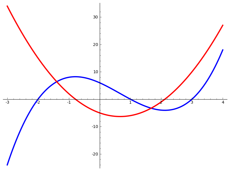
This set of values and this plot have nothing to do with each other. You’ll recognize that they’ve been liberated from earlier in this work.
Step back and simply examine how the pieces all fit together within a
<figure>.
The next paragraphs should start on a new page in PDF output if the standard publisher file is used.
Bully Pulpit.
View Source for paragraphs
<paragraphs xml:id="sidebyside-bully-pulpit">

  <title>Bully Pulpit</title>

  <p>
    Remember that <tag>sidebyside</tag> has attributes that strongly influence layout.
    That is intentional.
    But to support a variety of output formats, it does not allow overly-precise control, and they be viewed as providing <em>hints</em> to an implementer of a conversion.
    So for example, do not expect <tag>sidebyside</tag> to function like a <latex/> <c>tabular</c> or an <init>HTML</init> <c>table</c>.
  </p>

  <p>
    In particular, elements of two consecutive <tag>stack</tag> will not line up, unless perhaps you construct them identically.
    Consider a <tag>sbsgroup</tag> for something closer to putting items into rows.
  </p>

</paragraphs>
Remember that
<sidebyside> has attributes that strongly influence layout. That is intentional. But to support a variety of output formats, it does not allow overly-precise control, and they be viewed as providing hints to an implementer of a conversion. So for example, do not expect <sidebyside> to function like a LaTeX tabular or an HTML table.
In particular, elements of two consecutive
<stack> will not line up, unless perhaps you construct them identically. Consider a <sbsgroup> for something closer to putting items into rows.
Subsection 26.13 Other Panels
View Source for subsection
<subsection xml:id="subsection-sbs-other-panels">
<title>Other Panels</title>
<p>
Other elements may be placed within a <c>sidebyside</c> element.
Pure lists first.
</p>
<sidebyside>
<ol>
<li>
<p>
Footnotes: Fermat allusion at <xref ref="footnote-fermat" text="global"/>.
</p>
</li>
<li>
<p>
Examples: Mystery derivative at <xref ref="example-mysterious" text="global"/>.
</p>
</li>
<li>
<p>
Definition-like: A mathematical statement with no proof <xref ref="principle-principle" text="global"/>.
</p>
</li>
<li>
<p>
Figures: An early plot, <xref ref="figure-function-derivative"/>.
</p>
</li>
</ol>
<ul>
<li>
<p>
Footnotes: Fermat allusion at <xref ref="footnote-fermat" text="global"/>.
</p>
</li>
<li>
<p>
Examples: Mystery derivative at <xref ref="example-mysterious" text="global"/>.
</p>
</li>
<li>
<p>
Definition-like: A mathematical statement with no proof <xref ref="principle-principle" text="global"/>.
</p>
</li>
<li>
<p>
Figures: An early plot, <xref ref="figure-function-derivative"/>.
</p>
</li>
</ul>
</sidebyside>
<p>
You can place <em>aligned</em> equations in paragraphs within a <c>sidebyside</c> element.
</p>
<sidebyside valigns="middle top">
<p>
here is some text, and here is an equation that contains alignment.
<md>
<mrow>f(x)&= x^2+3x+2</mrow>
<mrow>&=(x+2)(x+1)</mrow>
</md>
</p>
<stack>
<p>
here is some text, and here is an equation that contains alignment.
<md>
<mrow>f(x)&= x^2+3x+2</mrow>
<mrow>&=(x+2)(x+1)</mrow>
</md>
</p>
<p>
here is some text, and here is an equation that contains alignment.
<md>
<mrow>f(x)&= x^2+3x+2</mrow>
<mrow>&=(x+2)(x+1)</mrow>
</md>
</p>
</stack>
</sidebyside>
<p>
Pre-formatted text may be included by using the <c>pre</c> element.
This content is horizontally-rigid, so as the author, you need to be sure to provide enough width for the panel to contain the content.
It is easy to see the boundary of the panels when rendered in HTML since there is a background that fills the panel.
</p>
<!-- https://excelwithbusiness.com/blog/post/web-design/say-hello-world-in-28-different-programming-languages -->
<figure>
<caption><q>Hello, World!</q> in Pascal and C++</caption>
<sidebyside widths="40% 50%">
<pre>
<cline>program HelloWorld;</cline>
<cline>begin</cline>
<cline> WriteLn('Hello, world!');</cline>
<cline>end.</cline>
</pre>
<pre>
#include
int main()
{
std::cout << "Hello, world!";
return 0;
}
</pre>
</sidebyside>
</figure>
<figure>
<caption>A graph defined by data (from Keller and Trotter's
<pubtitle>Applied Combinatorics</pubtitle>
)</caption>
<sidebyside widths="20% 40%" valign="middle" margins="15%">
<pre>
graph1.txt
9
6 2
1 5
1 7
6 8
9 1
4 3
5 7
1 3
5 9
7 9
</pre> <image source="images/keller-trotter-graph" archive="pdf svg"/>
</sidebyside>
</figure>
</subsection>
Other elements may be placed within a
sidebyside element. Pure lists first.
-
Footnotes: Fermat allusion at 2.1.
-
Examples: Mystery derivative at 4.2.
-
Definition-like: A mathematical statement with no proof 4.15.
-
Figures: An early plot, Figure 5.2.
-
Footnotes: Fermat allusion at 2.1.
-
Examples: Mystery derivative at 4.2.
-
Definition-like: A mathematical statement with no proof 4.15.
-
Figures: An early plot, Figure 5.2.
You can place aligned equations in paragraphs within a
sidebyside element.
here is some text, and here is an equation that contains alignment.
\begin{align*}
f(x)&= x^2+3x+2\\
&=(x+2)(x+1)
\end{align*}
here is some text, and here is an equation that contains alignment.
\begin{align*}
f(x)&= x^2+3x+2\\
&=(x+2)(x+1)
\end{align*}
here is some text, and here is an equation that contains alignment.
\begin{align*}
f(x)&= x^2+3x+2\\
&=(x+2)(x+1)
\end{align*}
Pre-formatted text may be included by using the
pre element. This content is horizontally-rigid, so as the author, you need to be sure to provide enough width for the panel to contain the content. It is easy to see the boundary of the panels when rendered in HTML since there is a background that fills the panel.
View Source for figure
<figure>
<caption><q>Hello, World!</q> in Pascal and C++</caption>
<sidebyside widths="40% 50%">
<pre>
<cline>program HelloWorld;</cline>
<cline>begin</cline>
<cline> WriteLn('Hello, world!');</cline>
<cline>end.</cline>
</pre>
<pre>
#include
int main()
{
std::cout << "Hello, world!";
return 0;
}
</pre>
</sidebyside>
</figure>
program HelloWorld;
begin
  WriteLn('Hello, world!');
end.
#include
int main()
{
    std::cout << "Hello, world!";
    return 0;
}
View Source for figure
                                                                        <figure>

                                                                          <caption>A graph defined by data (from Keller and Trotter's

                                                                          <pubtitle>Applied Combinatorics</pubtitle>
                                                                          )</caption>
                                                                          <sidebyside widths="20% 40%" valign="middle" margins="15%">

                                                                            <pre>
graph1.txt
9
6 2
1 5
1 7
6 8
9 1
4 3
5 7
1 3
5 9
7 9
                                                                            </pre> <image source="images/keller-trotter-graph" archive="pdf svg"/>

                                                                          </sidebyside>

                                                                        </figure>

Subsection 26.14 Poems as Side-By-Side Panels
View Source for subsection
<subsection>
<title>Poems as Side-By-Side Panels</title>
<p>
Poems
<idx>poem</idx>
may be panels of a side-by-side layout. Here we place some commentary alongside. See <xref ref="poetry"/> for general information about poetry.
</p>
<sidebyside widths="50% 50%">
<poem>
<title>Fire and Ice</title>
<idx>Fire and Ice, Frost</idx>
<author>
Robert Frost
</author>
<stanza>
<line>Some say the world will end in fire,</line>
<line>Some say in ice.</line>
<line>From what I've tasted of desire</line>
<line>I hold with those who favor fire.</line>
<line>But if it had to perish twice,</line>
<line>I think I know enough of hate</line>
<line>To say that for destruction ice</line>
<line>Is also great</line>
<line>And would suffice.</line>
</stanza>
</poem>
<stack>
<p>
You might have several things to say about a poem and you could use a sequence of paragraphs immediately adjacent.
</p>
<p>
This is a second paragraph of commentary.
</p>
</stack>
</sidebyside>
<p>
Poems are not horizontally-rigid, but they are not perfectly horizontally-flexible either. The left copy of this next poem is in a panel roughly 2/3 the width of the page and fits there. The right copy has the first five lines and is in space about half the previous width, and you can see the lines being wrapped with obvious indentation. So you <em>can</em> constrain the width of a poem if you do not mind the additional indentation. (Recognize that this example is a bit extreme.)
</p>
<sidebyside widths="68% 30%">
<poem>
<title>Sonnet to Liberty</title>
<idx>Sonnet to Liberty, Wilde</idx>
<author>
Oscar Wilde
</author>
<stanza>
<line>Not that I love thy children, whose dull eyes</line>
<line>See nothing save their own unlovely woe,</line>
<line>Whose minds know nothing, nothing care to know,</line>
<line>But that the roar of thy Democracies,</line>
<line>Thy reigns of Terror, thy great Anarchies,</line>
<line>Mirror my wildest passions like the sea,</line>
<line>And give my rage a brother! Liberty!</line>
<line>For this sake only do thy dissonant cries</line>
<line>Delight my discreet soul, else might all kings</line>
<line>By bloody knout or treacherous cannonades</line>
<line>Rob nations of their rights inviolate</line>
<line>And I remain unmoved-and yet, and yet,</line>
<line>These Christs that die upon the barricades,</line>
<line>God knows it I am with them, in some things.</line>
</stanza>
</poem>
<poem>
<title>Sonnet to Liberty</title>
<author>
Oscar Wilde
</author>
<stanza>
<line>Not that I love thy children, whose dull eyes</line>
<line>See nothing save their own unlovely woe,</line>
<line>Whose minds know nothing, nothing care to know,</line>
<line>But that the roar of thy Democracies,</line>
<line>Thy reigns of Terror, thy great Anarchies,</line>
<line><ellipsis/></line>
</stanza>
</poem>
</sidebyside>
</subsection>
Poems may be panels of a side-by-side layout. Here we place some commentary alongside. See Section 29 for general information about poetry.
Fire and Ice
View Source for poem
                                                                                                      <poem>

                                                                                                        <title>Fire and Ice</title>

                                                                                                        <idx>Fire and Ice, Frost</idx>

                                                                                                        <author>
Robert Frost
                                                                                                        </author>

                                                                                                        <stanza>

                                                                                                          <line>Some say the world will end in fire,</line>

                                                                                                          <line>Some say in ice.</line>

                                                                                                          <line>From what I've tasted of desire</line>

                                                                                                          <line>I hold with those who favor fire.</line>

                                                                                                          <line>But if it had to perish twice,</line>

                                                                                                          <line>I think I know enough of hate</line>

                                                                                                          <line>To say that for destruction ice</line>

                                                                                                          <line>Is also great</line>

                                                                                                          <line>And would suffice.</line>

                                                                                                        </stanza>

                                                                                                      </poem>
Some say the world will end in fire,
Some say in ice.
From what I’ve tasted of desire
I hold with those who favor fire.
But if it had to perish twice,
I think I know enough of hate
To say that for destruction ice
Is also great
And would suffice.
You might have several things to say about a poem and you could use a sequence of paragraphs immediately adjacent.
This is a second paragraph of commentary.
Poems are not horizontally-rigid, but they are not perfectly horizontally-flexible either. The left copy of this next poem is in a panel roughly 2/3 the width of the page and fits there. The right copy has the first five lines and is in space about half the previous width, and you can see the lines being wrapped with obvious indentation. So you can constrain the width of a poem if you do not mind the additional indentation. (Recognize that this example is a bit extreme.)
Sonnet to Liberty
View Source for poem
                                                                                                      <poem>

                                                                                                        <title>Sonnet to Liberty</title>

                                                                                                        <idx>Sonnet to Liberty, Wilde</idx>

                                                                                                        <author>
Oscar Wilde
                                                                                                        </author>

                                                                                                        <stanza>

                                                                                                          <line>Not that I love thy children, whose dull eyes</line>

                                                                                                          <line>See nothing save their own unlovely woe,</line>

                                                                                                          <line>Whose minds know nothing, nothing care to know,</line>

                                                                                                          <line>But that the roar of thy Democracies,</line>

                                                                                                          <line>Thy reigns of Terror, thy great Anarchies,</line>

                                                                                                          <line>Mirror my wildest passions like the sea,</line>

                                                                                                          <line>And give my rage a brother! Liberty!</line>

                                                                                                          <line>For this sake only do thy dissonant cries</line>

                                                                                                          <line>Delight my discreet soul, else might all kings</line>

                                                                                                          <line>By bloody knout or treacherous cannonades</line>

                                                                                                          <line>Rob nations of their rights inviolate</line>

                                                                                                          <line>And I remain unmoved-and yet, and yet,</line>

                                                                                                          <line>These Christs that die upon the barricades,</line>

                                                                                                          <line>God knows it I am with them, in some things.</line>

                                                                                                        </stanza>

                                                                                                      </poem>
Not that I love thy children, whose dull eyes
See nothing save their own unlovely woe,
Whose minds know nothing, nothing care to know,
But that the roar of thy Democracies,
Thy reigns of Terror, thy great Anarchies,
Mirror my wildest passions like the sea,
And give my rage a brother! Liberty!
For this sake only do thy dissonant cries
Delight my discreet soul, else might all kings
By bloody knout or treacherous cannonades
Rob nations of their rights inviolate
And I remain unmoved-and yet, and yet,
These Christs that die upon the barricades,
God knows it I am with them, in some things.
Sonnet to Liberty
View Source for poem
                                                                                                      <poem>

                                                                                                        <title>Sonnet to Liberty</title>

                                                                                                        <author>
Oscar Wilde
                                                                                                        </author>

                                                                                                        <stanza>

                                                                                                          <line>Not that I love thy children, whose dull eyes</line>

                                                                                                          <line>See nothing save their own unlovely woe,</line>

                                                                                                          <line>Whose minds know nothing, nothing care to know,</line>

                                                                                                          <line>But that the roar of thy Democracies,</line>

                                                                                                          <line>Thy reigns of Terror, thy great Anarchies,</line>

                                                                                                          <line><ellipsis/></line>

                                                                                                        </stanza>

                                                                                                      </poem>
Not that I love thy children, whose dull eyes
See nothing save their own unlovely woe,
Whose minds know nothing, nothing care to know,
But that the roar of thy Democracies,
Thy reigns of Terror, thy great Anarchies,
…
Subsection 26.15 Side-By-Side Groups
View Source for subsection
<subsection xml:id="subsection-sbsgroup">
<title>Side-By-Side Groups</title>
<p>
A <q>side-by-side group,</q> <tag>sbsgroup</tag>, is still in development. (Notably, subcaptions do not behave as expected.) It is a sequence of <c>sidebyside</c>, which may conceivably use the same margins, widths and vertical alignments for each horizontal run of panels. Attributes on the <c>sbsgroup</c> are global to the group's enclosed <c>sidebyside</c>, and will be used by each contained <c>sidebyside</c>. If attributes are present on an individual <c>sidebyside</c>, they override the global values. The next two examples demonstrate some of this behavior, in a limited way.
</p>
<figure>
<caption>Overall SBS Group</caption>
<sbsgroup widths="5% 5% 5%" margins="30%">
<sidebyside>
<p>
One.
</p>
<p>
Two.
</p>
<p>
Three.
</p>
</sidebyside>
<sidebyside widths="25% 20% 15%" margins="5%">
<p>
Four.
</p>
<p>
Five.
</p>
<p>
Six.
</p>
</sidebyside>
</sbsgroup>
</figure>
<p>
A long poem, when placed into a <c>sidebyside</c> will not fit onto a physical page and will not break across pages. With a <c>sbsgroup</c> you can put each stanza (say) into its own <c>sidebyside</c> and place something (commentary) next to it. We include the <c>title</c> with the first stanza and the <c>author</c> with the last stanza. This device can also be useful to attach commentary to specific stanzas.
</p>
<sbsgroup widths="60% 40%">
<sidebyside>
<poem>
<title>The Stolen Child</title>
<idx>Stolen Child, The, Yeats</idx>
<stanza>
<line>Where dips the rocky highland</line>
<line>Of Sleuth Wood in the lake,</line>
<line>There lies a leafy island</line>
<line>Where flapping herons wake</line>
<line>The drowsy water-rats;</line>
<line>There we've hid our faery vats,</line>
<line>Full of berries</line>
<line>And of reddest stolen cherries.</line>
<line>Come away, O human child!</line>
<line>To the waters and the wild</line>
<line>With a faery, hand in hand,</line>
<line>For the world's more full of weeping than you</line>
<line>can understand.</line>
</stanza>
</poem>
<stack>
<p>
Some commentary on Stanza One.
</p>
</stack>
</sidebyside>
<!-- -->
<sidebyside>
<poem>
<stanza>
<line>Where the wave of moonlight glosses</line>
<line>The dim grey sands with light,</line>
<line>Far off by furthest Rosses</line>
<line>We foot it all the night,</line>
<line>Weaving olden dances,</line>
<line>Mingling hands and mingling glances</line>
<line>Till the moon has taken flight;</line>
<line>To and fro we leap</line>
<line>And chase the frothy bubbles,</line>
<line>While the world is full of troubles</line>
<line>And is anxious in its sleep.</line>
<line>Come away, O human child!</line>
<line>To the waters and the wild</line>
<line>With a faery, hand in hand,</line>
<line>For the world's more full of weeping than you</line>
<line>can understand.</line>
</stanza>
</poem>
<stack>
<p>
Some commentary on Stanza Two.
</p>
</stack>
</sidebyside>
<!-- -->
<sidebyside>
<poem>
<stanza>
<line>Where the wandering water gushes</line>
<line>From the hills above Glen-Car,</line>
<line>In pools among the rushes</line>
<line>That scarce could bathe a star,</line>
<line>We seek for slumbering trout</line>
<line>And whispering in their ears</line>
<line>Give them unquiet dreams;</line>
<line>Leaning softly out</line>
<line>From ferns that drop their tears</line>
<line>Over the young streams.</line>
<line>Come away, O human child!</line>
<line>To the waters and the wild</line>
<line>With a faery, hand in hand,</line>
<line>For the world's more full of weeping than you</line>
<line>can understand.</line>
</stanza>
</poem>
<stack>
<p>
Some commentary on Stanza Three.
</p>
</stack>
</sidebyside>
<!-- -->
<sidebyside>
<poem>
<author>
William Butler Yeats
</author>
<stanza>
<line>Away with us he's going,</line>
<line>The solemn-eyed:</line>
<line>He'll hear no more the lowing</line>
<line>Of the calves on the warm hillside</line>
<line>Or the kettle on the hob</line>
<line>Sing peace into his breast,</line>
<line>Or see the brown mice bob</line>
<line>Round and round the oatmeal-chest.</line>
<line>For he comes, the human child,</line>
<line>To the waters and the wild</line>
<line>With a faery, hand in hand,</line>
<line>From a world more full of weeping than he</line>
<line>can understand.</line>
</stanza>
</poem>
<stack>
<p>
Some commentary on Stanza Four.
</p>
</stack>
</sidebyside>
<!-- -->
</sbsgroup>
<p>
The main rationale for <c>sbsgroup</c> is to layout a grid of items, and by placing the layout parameters on the <c>sbsgroup</c> element, the items can line up across <c>sidebyside</c> and subcaptioning can run across the whole group. So, for example, if you have images to compare by placing in a grid, then making them all the same size, or of the same aspect ratio, can help with the overall consistency.
</p>
<p>
This example has three <c>sidebyside</c>, each with four <c>figure</c> containing an identical <c>image</c>. Since the images are identical and the <c>width</c> is set to 20% they should all line up nicely with little effort. Since the default for margins is automatic, the remaining 20% of the overall width will be used for three inter-panel spaces of 5% and two margins of 2.5% each. Note the numbering of these as independent figures. We have left the captions empty for reasons of space, but you could add more information. Note that in print, a page break is allowed between any two of the <c>sidebyside</c> and cannot be suppressed.
</p>
<sbsgroup width="20%">
<sidebyside>
<figure>
<caption/>
<image source="images/cross-rectangle.png"/>
</figure>
<figure>
<caption/>
<image source="images/cross-rectangle.png"/>
</figure>
<figure>
<caption/>
<image source="images/cross-rectangle.png"/>
</figure>
<figure>
<caption/>
<image source="images/cross-rectangle.png"/>
</figure>
</sidebyside>
<sidebyside>
<figure>
<caption/>
<image source="images/cross-rectangle.png"/>
</figure>
<figure>
<caption/>
<image source="images/cross-rectangle.png"/>
</figure>
<figure>
<caption/>
<image source="images/cross-rectangle.png"/>
</figure>
<figure>
<caption/>
<image source="images/cross-rectangle.png"/>
</figure>
</sidebyside>
<sidebyside>
<figure>
<caption/>
<image source="images/cross-rectangle.png"/>
</figure>
<figure>
<caption/>
<image source="images/cross-rectangle.png"/>
</figure>
<figure>
<caption/>
<image source="images/cross-rectangle.png"/>
</figure>
<figure>
<caption/>
<image source="images/cross-rectangle.png"/>
</figure>
</sidebyside>
</sbsgroup>
<p>
We recycle the prior <c>sbsgroup</c> but now put it in its own overall figure. That will allow a caption for the whole group, and will cause the twelve figures to be subcaptioned. Except the subcaptioning is not implemented. Soon.
</p>
<figure>
<caption>Twelve images, arranged in a grid</caption>
<sbsgroup width="20%">
<sidebyside>
<figure>
<caption/>
<image source="images/cross-rectangle.png"/>
</figure>
<figure>
<caption/>
<image source="images/cross-rectangle.png"/>
</figure>
<figure>
<caption/>
<image source="images/cross-rectangle.png"/>
</figure>
<figure>
<caption/>
<image source="images/cross-rectangle.png"/>
</figure>
</sidebyside>
<sidebyside>
<figure>
<caption/>
<image source="images/cross-rectangle.png"/>
</figure>
<figure>
<caption/>
<image source="images/cross-rectangle.png"/>
</figure>
<figure>
<caption/>
<image source="images/cross-rectangle.png"/>
</figure>
<figure>
<caption/>
<image source="images/cross-rectangle.png"/>
</figure>
</sidebyside>
<sidebyside>
<figure>
<caption/>
<image source="images/cross-rectangle.png"/>
</figure>
<figure>
<caption/>
<image source="images/cross-rectangle.png"/>
</figure>
<figure>
<caption/>
<image source="images/cross-rectangle.png"/>
</figure>
<figure>
<caption/>
<image source="images/cross-rectangle.png"/>
</figure>
</sidebyside>
</sbsgroup>
</figure>
<p>
One more test. We override the spacing and vertical alignments of the middle <c>sidebyside</c>. Note that it is easy to make a panel so skinny that even the smallest possible caption does not fit in the width.
</p>
<sbsgroup width="20%">
<sidebyside>
<figure>
<caption/>
<image source="images/cross-rectangle.png"/>
</figure>
<figure>
<caption/>
<image source="images/cross-rectangle.png"/>
</figure>
<figure>
<caption/>
<image source="images/cross-rectangle.png"/>
</figure>
<figure>
<caption/>
<image source="images/cross-rectangle.png"/>
</figure>
</sidebyside>
<sidebyside margins="0%" widths="5% 10% 20% 30%" valigns="middle top bottom middle">
<figure>
<caption/>
<image source="images/cross-rectangle.png"/>
</figure>
<figure>
<caption/>
<image source="images/cross-rectangle.png"/>
</figure>
<figure>
<caption/>
<image source="images/cross-rectangle.png"/>
</figure>
<figure>
<caption/>
<image source="images/cross-rectangle.png"/>
</figure>
</sidebyside>
<sidebyside>
<figure>
<caption/>
<image source="images/cross-rectangle.png"/>
</figure>
<figure>
<caption/>
<image source="images/cross-rectangle.png"/>
</figure>
<figure>
<caption/>
<image source="images/cross-rectangle.png"/>
</figure>
<figure>
<caption/>
<image source="images/cross-rectangle.png"/>
</figure>
</sidebyside>
</sbsgroup>
<p>
Now an <tag>sbsgroup</tag> that should start on a new page if this sample article is built to PDF using the distribution publisher file.
</p>
<sbsgroup xml:id="sbsgroup-pagebreak-test" width="20%">
<sidebyside>
<figure>
<caption/>
<image source="images/cross-rectangle.png"/>
</figure>
<figure>
<caption/>
<image source="images/cross-rectangle.png"/>
</figure>
<figure>
<caption/>
<image source="images/cross-rectangle.png"/>
</figure>
<figure>
<caption/>
<image source="images/cross-rectangle.png"/>
</figure>
</sidebyside>
<sidebyside>
<figure>
<caption/>
<image source="images/cross-rectangle.png"/>
</figure>
<figure>
<caption/>
<image source="images/cross-rectangle.png"/>
</figure>
<figure>
<caption/>
<image source="images/cross-rectangle.png"/>
</figure>
<figure>
<caption/>
<image source="images/cross-rectangle.png"/>
</figure>
</sidebyside>
</sbsgroup>
<p>
The following is a <tag>sbsgroup</tag> full of <q>operation</q> tables. Once upon a time it was rather cramped vertically in HTML output, but Andrew Scholer improved the spacing at <url href="https://github.com/PreTeXtBook/pretext/pull/2387" visual="github.com/PreTeXtBook/pretext/pull/2387">GitHub #2387</url>. The example is from Valerio Monti.
</p>
<figure xml:id="tabelle_classi_di_resto">
<caption>Tabelle delle operazioni per <m>1\le n\le 4</m></caption>
<sbsgroup>
<sidebyside>
<p>
<md>
\begin{array}{c|c} + \amp \class[1]{0} \\ \hline \class[1]{0} \amp \class[1]{0} \end{array}
</md>
</p>
<p>
<md>
\begin{array}{c|c} \cdot \amp \class[1]{0} \\ \hline \class[1]{0} \amp \class[1]{0} \end{array}
</md>
</p>
</sidebyside>
<sidebyside>
<p>
<md>
\begin{array}{c|cc} + \amp \class[2]{0} \amp \class[2]{1} \\ \hline \class[2]{0} \amp \class[2]{0} \amp \class[2]{1}\\ \class[2]{1} \amp \class[2]{1} \amp \class[2]{0} \end{array}
</md>
</p>
<p>
<md>
\begin{array}{c|cc} \cdot \amp \class[2]{0} \amp \class[2]{1} \\ \hline \class[2]{0} \amp \class[2]{0} \amp \class[2]{0}\\ \class[2]{1} \amp \class[2]{0} \amp \class[2]{1} \end{array}
</md>
</p>
</sidebyside>
<sidebyside>
<p>
<md>
\begin{array}{c|ccc} + \amp \class[3]{0} \amp \class[3]{1} \amp \class[3]{2} \\ \hline \class[3]{0} \amp \class[3]{0} \amp \class[3]{1} \amp \class[3]{2} \\ \class[3]{1} \amp \class[3]{1} \amp \class[3]{2} \amp \class[3]{0} \\ \class[3]{2} \amp \class[3]{2} \amp \class[3]{0} \amp \class[3]{1} \\ \end{array}
</md>
</p>
<p>
<md>
\begin{array}{c|ccc} \cdot \amp \class[3]{0} \amp \class[3]{1} \amp \class[3]{2} \\ \hline \class[3]{0} \amp \class[3]{0} \amp \class[3]{0} \amp \class[3]{0} \\ \class[3]{1} \amp \class[3]{0} \amp \class[3]{1} \amp \class[3]{2} \\ \class[3]{2} \amp \class[3]{0} \amp \class[3]{2} \amp \class[3]{1} \\ \end{array}
</md>
</p>
</sidebyside>
<sidebyside>
<p>
<md>
\begin{array}{c|cccc} + \amp \class[4]{0} \amp \class[4]{1} \amp \class[4]{2} \amp \class[4]{3} \\ \hline \class[4]{0} \amp \class[4]{0} \amp \class[4]{1} \amp \class[4]{2} \amp \class[4]{3} \\ \class[4]{1} \amp \class[4]{1} \amp \class[4]{2} \amp \class[4]{3} \amp \class[4]{0} \\ \class[4]{2} \amp \class[4]{2} \amp \class[4]{3} \amp \class[4]{0} \amp \class[4]{1} \\ \class[4]{3} \amp \class[4]{3} \amp \class[4]{0} \amp \class[4]{1} \amp \class[4]{2} \\ \end{array}
</md>
</p>
<p>
<md>
\begin{array}{c|cccc} \cdot \amp \class[4]{0} \amp \class[4]{1} \amp \class[4]{2} \amp \class[4]{3} \\ \hline \class[4]{0} \amp \class[4]{0} \amp \class[4]{0} \amp \class[4]{0} \amp \class[4]{0} \\ \class[4]{1} \amp \class[4]{0} \amp \class[4]{1} \amp \class[4]{2} \amp \class[4]{3} \\ \class[4]{2} \amp \class[4]{0} \amp \class[4]{2} \amp \class[4]{0} \amp \class[4]{2} \\ \class[4]{3} \amp \class[4]{0} \amp \class[4]{3} \amp \class[4]{2} \amp \class[4]{1} \\ \end{array}
</md>
</p>
</sidebyside>
</sbsgroup>
</figure>
</subsection>
A “side-by-side group,”
<sbsgroup>, is still in development. (Notably, subcaptions do not behave as expected.) It is a sequence of sidebyside, which may conceivably use the same margins, widths and vertical alignments for each horizontal run of panels. Attributes on the sbsgroup are global to the group’s enclosed sidebyside, and will be used by each contained sidebyside. If attributes are present on an individual sidebyside, they override the global values. The next two examples demonstrate some of this behavior, in a limited way.
View Source for figure
                                                                                                    <figure>

                                                                                                      <caption>Overall SBS Group</caption>

                                                                                                      <sbsgroup widths="5% 5% 5%" margins="30%">

                                                                                                        <sidebyside>

                                                                                                          <p>
One.
                                                                                                          </p>

                                                                                                          <p>
Two.
                                                                                                          </p>

                                                                                                          <p>
Three.
                                                                                                          </p>

                                                                                                        </sidebyside>

                                                                                                        <sidebyside widths="25% 20% 15%" margins="5%">

                                                                                                          <p>
Four.
                                                                                                          </p>

                                                                                                          <p>
Five.
                                                                                                          </p>

                                                                                                          <p>
Six.
                                                                                                          </p>

                                                                                                        </sidebyside>

                                                                                                      </sbsgroup>

                                                                                                    </figure>
One.
Two.
Three.
Four.
Five.
Six.
A long poem, when placed into a
sidebyside will not fit onto a physical page and will not break across pages. With a sbsgroup you can put each stanza (say) into its own sidebyside and place something (commentary) next to it. We include the title with the first stanza and the author with the last stanza. This device can also be useful to attach commentary to specific stanzas.
The Stolen Child
View Source for poem
<poem>

  <title>The Stolen Child</title>

  <idx>Stolen Child, The, Yeats</idx>

  <stanza>

    <line>Where dips the rocky highland</line>

    <line>Of Sleuth Wood in the lake,</line>

    <line>There lies a leafy island</line>

    <line>Where flapping herons wake</line>

    <line>The drowsy water-rats;</line>

    <line>There we've hid our faery vats,</line>

    <line>Full of berries</line>

    <line>And of reddest stolen cherries.</line>

    <line>Come away, O human child!</line>

    <line>To the waters and the wild</line>

    <line>With a faery, hand in hand,</line>

    <line>For the world's more full of weeping than you</line>

    <line>can understand.</line>

  </stanza>

</poem>
Where dips the rocky highland
Of Sleuth Wood in the lake,
There lies a leafy island
Where flapping herons wake
The drowsy water-rats;
There we’ve hid our faery vats,
Full of berries
And of reddest stolen cherries.
Come away, O human child!
To the waters and the wild
With a faery, hand in hand,
For the world’s more full of weeping than you
can understand.
Some commentary on Stanza One.
View Source for poem
<poem>

  <stanza>

    <line>Where the wave of moonlight glosses</line>

    <line>The dim grey sands with light,</line>

    <line>Far off by furthest Rosses</line>

    <line>We foot it all the night,</line>

    <line>Weaving olden dances,</line>

    <line>Mingling hands and mingling glances</line>

    <line>Till the moon has taken flight;</line>

    <line>To and fro we leap</line>

    <line>And chase the frothy bubbles,</line>

    <line>While the world is full of troubles</line>

    <line>And is anxious in its sleep.</line>

    <line>Come away, O human child!</line>

    <line>To the waters and the wild</line>

    <line>With a faery, hand in hand,</line>

    <line>For the world's more full of weeping than you</line>

    <line>can understand.</line>

  </stanza>

</poem>
Where the wave of moonlight glosses
The dim grey sands with light,
Far off by furthest Rosses
We foot it all the night,
Weaving olden dances,
Mingling hands and mingling glances
Till the moon has taken flight;
To and fro we leap
And chase the frothy bubbles,
While the world is full of troubles
And is anxious in its sleep.
Come away, O human child!
To the waters and the wild
With a faery, hand in hand,
For the world’s more full of weeping than you
can understand.
Some commentary on Stanza Two.
View Source for poem
<poem>

  <stanza>

    <line>Where the wandering water gushes</line>

    <line>From the hills above Glen-Car,</line>

    <line>In pools among the rushes</line>

    <line>That scarce could bathe a star,</line>

    <line>We seek for slumbering trout</line>

    <line>And whispering in their ears</line>

    <line>Give them unquiet dreams;</line>

    <line>Leaning softly out</line>

    <line>From ferns that drop their tears</line>

    <line>Over the young streams.</line>

    <line>Come away, O human child!</line>

    <line>To the waters and the wild</line>

    <line>With a faery, hand in hand,</line>

    <line>For the world's more full of weeping than you</line>

    <line>can understand.</line>

  </stanza>

</poem>
Where the wandering water gushes
From the hills above Glen-Car,
In pools among the rushes
That scarce could bathe a star,
We seek for slumbering trout
And whispering in their ears
Give them unquiet dreams;
Leaning softly out
From ferns that drop their tears
Over the young streams.
Come away, O human child!
To the waters and the wild
With a faery, hand in hand,
For the world’s more full of weeping than you
can understand.
Some commentary on Stanza Three.
View Source for poem
                                                                                                        <poem>

                                                                                                          <author>
William Butler Yeats
                                                                                                          </author>

                                                                                                          <stanza>

                                                                                                            <line>Away with us he's going,</line>

                                                                                                            <line>The solemn-eyed:</line>

                                                                                                            <line>He'll hear no more the lowing</line>

                                                                                                            <line>Of the calves on the warm hillside</line>

                                                                                                            <line>Or the kettle on the hob</line>

                                                                                                            <line>Sing peace into his breast,</line>

                                                                                                            <line>Or see the brown mice bob</line>

                                                                                                            <line>Round and round the oatmeal-chest.</line>

                                                                                                            <line>For he comes, the human child,</line>

                                                                                                            <line>To the waters and the wild</line>

                                                                                                            <line>With a faery, hand in hand,</line>

                                                                                                            <line>From a world more full of weeping than he</line>

                                                                                                            <line>can understand.</line>

                                                                                                          </stanza>

                                                                                                        </poem>
Away with us he’s going,
The solemn-eyed:
He’ll hear no more the lowing
Of the calves on the warm hillside
Or the kettle on the hob
Sing peace into his breast,
Or see the brown mice bob
Round and round the oatmeal-chest.
For he comes, the human child,
To the waters and the wild
With a faery, hand in hand,
From a world more full of weeping than he
can understand.
Some commentary on Stanza Four.
The main rationale for
sbsgroup is to layout a grid of items, and by placing the layout parameters on the sbsgroup element, the items can line up across sidebyside and subcaptioning can run across the whole group. So, for example, if you have images to compare by placing in a grid, then making them all the same size, or of the same aspect ratio, can help with the overall consistency.
This example has three
sidebyside, each with four figure containing an identical image. Since the images are identical and the width is set to 20% they should all line up nicely with little effort. Since the default for margins is automatic, the remaining 20% of the overall width will be used for three inter-panel spaces of 5% and two margins of 2.5% each. Note the numbering of these as independent figures. We have left the captions empty for reasons of space, but you could add more information. Note that in print, a page break is allowed between any two of the sidebyside and cannot be suppressed.
View Source for figure
<figure>

  <caption/>

  <image source="images/cross-rectangle.png"/>

  </figure>
View Source for figure
<figure>

  <caption/>

  <image source="images/cross-rectangle.png"/>

  </figure>
View Source for figure
<figure>

  <caption/>

  <image source="images/cross-rectangle.png"/>

  </figure>
View Source for figure
<figure>

  <caption/>

  <image source="images/cross-rectangle.png"/>

  </figure>
View Source for figure
<figure>

  <caption/>

  <image source="images/cross-rectangle.png"/>

  </figure>
View Source for figure
<figure>

  <caption/>

  <image source="images/cross-rectangle.png"/>

  </figure>
View Source for figure
<figure>

  <caption/>

  <image source="images/cross-rectangle.png"/>

  </figure>
View Source for figure
<figure>

  <caption/>

  <image source="images/cross-rectangle.png"/>

  </figure>
View Source for figure
<figure>

  <caption/>

  <image source="images/cross-rectangle.png"/>

  </figure>
View Source for figure
<figure>

  <caption/>

  <image source="images/cross-rectangle.png"/>

  </figure>
View Source for figure
<figure>

  <caption/>

  <image source="images/cross-rectangle.png"/>

  </figure>
View Source for figure
<figure>

  <caption/>

  <image source="images/cross-rectangle.png"/>

  </figure>
We recycle the prior
sbsgroup but now put it in its own overall figure. That will allow a caption for the whole group, and will cause the twelve figures to be subcaptioned. Except the subcaptioning is not implemented. Soon.
View Source for figure
<figure>

  <caption>Twelve images, arranged in a grid</caption>

  <sbsgroup width="20%">

    <sidebyside>

      <figure>

        <caption/>

        <image source="images/cross-rectangle.png"/>

        </figure>

        <figure>

          <caption/>

          <image source="images/cross-rectangle.png"/>

          </figure>

          <figure>

            <caption/>

            <image source="images/cross-rectangle.png"/>

            </figure>

            <figure>

              <caption/>

              <image source="images/cross-rectangle.png"/>

              </figure>

            </sidebyside>

            <sidebyside>

              <figure>

                <caption/>

                <image source="images/cross-rectangle.png"/>

                </figure>

                <figure>

                  <caption/>

                  <image source="images/cross-rectangle.png"/>

                  </figure>

                  <figure>

                    <caption/>

                    <image source="images/cross-rectangle.png"/>

                    </figure>

                    <figure>

                      <caption/>

                      <image source="images/cross-rectangle.png"/>

                      </figure>

                    </sidebyside>

                    <sidebyside>

                      <figure>

                        <caption/>

                        <image source="images/cross-rectangle.png"/>

                        </figure>

                        <figure>

                          <caption/>

                          <image source="images/cross-rectangle.png"/>

                          </figure>

                          <figure>

                            <caption/>

                            <image source="images/cross-rectangle.png"/>

                            </figure>

                            <figure>

                              <caption/>

                              <image source="images/cross-rectangle.png"/>

                              </figure>

                            </sidebyside>

                          </sbsgroup>

                        </figure>
View Source for figure
<figure>

  <caption/>

  <image source="images/cross-rectangle.png"/>

  </figure>
View Source for figure
<figure>

  <caption/>

  <image source="images/cross-rectangle.png"/>

  </figure>
View Source for figure
<figure>

  <caption/>

  <image source="images/cross-rectangle.png"/>

  </figure>
View Source for figure
<figure>

  <caption/>

  <image source="images/cross-rectangle.png"/>

  </figure>
View Source for figure
<figure>

  <caption/>

  <image source="images/cross-rectangle.png"/>

  </figure>
View Source for figure
<figure>

  <caption/>

  <image source="images/cross-rectangle.png"/>

  </figure>
View Source for figure
<figure>

  <caption/>

  <image source="images/cross-rectangle.png"/>

  </figure>
View Source for figure
<figure>

  <caption/>

  <image source="images/cross-rectangle.png"/>

  </figure>
View Source for figure
<figure>

  <caption/>

  <image source="images/cross-rectangle.png"/>

  </figure>
View Source for figure
<figure>

  <caption/>

  <image source="images/cross-rectangle.png"/>

  </figure>
View Source for figure
<figure>

  <caption/>

  <image source="images/cross-rectangle.png"/>

  </figure>
View Source for figure
<figure>

  <caption/>

  <image source="images/cross-rectangle.png"/>

  </figure>
One more test. We override the spacing and vertical alignments of the middle
sidebyside. Note that it is easy to make a panel so skinny that even the smallest possible caption does not fit in the width.
View Source for figure
<figure>

  <caption/>

  <image source="images/cross-rectangle.png"/>

  </figure>
View Source for figure
<figure>

  <caption/>

  <image source="images/cross-rectangle.png"/>

  </figure>
View Source for figure
<figure>

  <caption/>

  <image source="images/cross-rectangle.png"/>

  </figure>
View Source for figure
<figure>

  <caption/>

  <image source="images/cross-rectangle.png"/>

  </figure>
View Source for figure
<figure>

  <caption/>

  <image source="images/cross-rectangle.png"/>

  </figure>
View Source for figure
<figure>

  <caption/>

  <image source="images/cross-rectangle.png"/>

  </figure>
View Source for figure
<figure>

  <caption/>

  <image source="images/cross-rectangle.png"/>

  </figure>
View Source for figure
<figure>

  <caption/>

  <image source="images/cross-rectangle.png"/>

  </figure>
View Source for figure
<figure>

  <caption/>

  <image source="images/cross-rectangle.png"/>

  </figure>
View Source for figure
<figure>

  <caption/>

  <image source="images/cross-rectangle.png"/>

  </figure>
View Source for figure
<figure>

  <caption/>

  <image source="images/cross-rectangle.png"/>

  </figure>
View Source for figure
<figure>

  <caption/>

  <image source="images/cross-rectangle.png"/>

  </figure>
Now an
<sbsgroup> that should start on a new page if this sample article is built to PDF using the distribution publisher file.
View Source for figure
<figure>

  <caption/>

  <image source="images/cross-rectangle.png"/>

  </figure>
View Source for figure
<figure>

  <caption/>

  <image source="images/cross-rectangle.png"/>

  </figure>
View Source for figure
<figure>

  <caption/>

  <image source="images/cross-rectangle.png"/>

  </figure>
View Source for figure
<figure>

  <caption/>

  <image source="images/cross-rectangle.png"/>

  </figure>
View Source for figure
<figure>

  <caption/>

  <image source="images/cross-rectangle.png"/>

  </figure>
View Source for figure
<figure>

  <caption/>

  <image source="images/cross-rectangle.png"/>

  </figure>
View Source for figure
<figure>

  <caption/>

  <image source="images/cross-rectangle.png"/>

  </figure>
View Source for figure
<figure>

  <caption/>

  <image source="images/cross-rectangle.png"/>

  </figure>
The following is a
<sbsgroup> full of “operation” tables. Once upon a time it was rather cramped vertically in HTML output, but Andrew Scholer improved the spacing at GitHub #2387. The example is from Valerio Monti.
View Source for figure
<figure xml:id="tabelle_classi_di_resto">
<caption>Tabelle delle operazioni per <m>1\le n\le 4</m></caption>
<sbsgroup>
<sidebyside>
<p>
<md>
\begin{array}{c|c} + \amp \class[1]{0} \\ \hline \class[1]{0} \amp \class[1]{0} \end{array}
</md>
</p>
<p>
<md>
\begin{array}{c|c} \cdot \amp \class[1]{0} \\ \hline \class[1]{0} \amp \class[1]{0} \end{array}
</md>
</p>
</sidebyside>
<sidebyside>
<p>
<md>
\begin{array}{c|cc} + \amp \class[2]{0} \amp \class[2]{1} \\ \hline \class[2]{0} \amp \class[2]{0} \amp \class[2]{1}\\ \class[2]{1} \amp \class[2]{1} \amp \class[2]{0} \end{array}
</md>
</p>
<p>
<md>
\begin{array}{c|cc} \cdot \amp \class[2]{0} \amp \class[2]{1} \\ \hline \class[2]{0} \amp \class[2]{0} \amp \class[2]{0}\\ \class[2]{1} \amp \class[2]{0} \amp \class[2]{1} \end{array}
</md>
</p>
</sidebyside>
<sidebyside>
<p>
<md>
\begin{array}{c|ccc} + \amp \class[3]{0} \amp \class[3]{1} \amp \class[3]{2} \\ \hline \class[3]{0} \amp \class[3]{0} \amp \class[3]{1} \amp \class[3]{2} \\ \class[3]{1} \amp \class[3]{1} \amp \class[3]{2} \amp \class[3]{0} \\ \class[3]{2} \amp \class[3]{2} \amp \class[3]{0} \amp \class[3]{1} \\ \end{array}
</md>
</p>
<p>
<md>
\begin{array}{c|ccc} \cdot \amp \class[3]{0} \amp \class[3]{1} \amp \class[3]{2} \\ \hline \class[3]{0} \amp \class[3]{0} \amp \class[3]{0} \amp \class[3]{0} \\ \class[3]{1} \amp \class[3]{0} \amp \class[3]{1} \amp \class[3]{2} \\ \class[3]{2} \amp \class[3]{0} \amp \class[3]{2} \amp \class[3]{1} \\ \end{array}
</md>
</p>
</sidebyside>
<sidebyside>
<p>
<md>
\begin{array}{c|cccc} + \amp \class[4]{0} \amp \class[4]{1} \amp \class[4]{2} \amp \class[4]{3} \\ \hline \class[4]{0} \amp \class[4]{0} \amp \class[4]{1} \amp \class[4]{2} \amp \class[4]{3} \\ \class[4]{1} \amp \class[4]{1} \amp \class[4]{2} \amp \class[4]{3} \amp \class[4]{0} \\ \class[4]{2} \amp \class[4]{2} \amp \class[4]{3} \amp \class[4]{0} \amp \class[4]{1} \\ \class[4]{3} \amp \class[4]{3} \amp \class[4]{0} \amp \class[4]{1} \amp \class[4]{2} \\ \end{array}
</md>
</p>
<p>
<md>
\begin{array}{c|cccc} \cdot \amp \class[4]{0} \amp \class[4]{1} \amp \class[4]{2} \amp \class[4]{3} \\ \hline \class[4]{0} \amp \class[4]{0} \amp \class[4]{0} \amp \class[4]{0} \amp \class[4]{0} \\ \class[4]{1} \amp \class[4]{0} \amp \class[4]{1} \amp \class[4]{2} \amp \class[4]{3} \\ \class[4]{2} \amp \class[4]{0} \amp \class[4]{2} \amp \class[4]{0} \amp \class[4]{2} \\ \class[4]{3} \amp \class[4]{0} \amp \class[4]{3} \amp \class[4]{2} \amp \class[4]{1} \\ \end{array}
</md>
</p>
</sidebyside>
</sbsgroup>
</figure>
\begin{equation*}
\begin{array}{c|c} + \amp \class[1]{0} \\ \hline \class[1]{0} \amp \class[1]{0} \end{array}
\end{equation*}
\begin{equation*}
\begin{array}{c|c} \cdot \amp \class[1]{0} \\ \hline \class[1]{0} \amp \class[1]{0} \end{array}
\end{equation*}
\begin{equation*}
\begin{array}{c|cc} + \amp \class[2]{0} \amp \class[2]{1} \\ \hline \class[2]{0} \amp \class[2]{0} \amp \class[2]{1}\\ \class[2]{1} \amp \class[2]{1} \amp \class[2]{0} \end{array}
\end{equation*}
\begin{equation*}
\begin{array}{c|cc} \cdot \amp \class[2]{0} \amp \class[2]{1} \\ \hline \class[2]{0} \amp \class[2]{0} \amp \class[2]{0}\\ \class[2]{1} \amp \class[2]{0} \amp \class[2]{1} \end{array}
\end{equation*}
\begin{equation*}
\begin{array}{c|ccc} + \amp \class[3]{0} \amp \class[3]{1} \amp \class[3]{2} \\ \hline \class[3]{0} \amp \class[3]{0} \amp \class[3]{1} \amp \class[3]{2} \\ \class[3]{1} \amp \class[3]{1} \amp \class[3]{2} \amp \class[3]{0} \\ \class[3]{2} \amp \class[3]{2} \amp \class[3]{0} \amp \class[3]{1} \\ \end{array}
\end{equation*}
\begin{equation*}
\begin{array}{c|ccc} \cdot \amp \class[3]{0} \amp \class[3]{1} \amp \class[3]{2} \\ \hline \class[3]{0} \amp \class[3]{0} \amp \class[3]{0} \amp \class[3]{0} \\ \class[3]{1} \amp \class[3]{0} \amp \class[3]{1} \amp \class[3]{2} \\ \class[3]{2} \amp \class[3]{0} \amp \class[3]{2} \amp \class[3]{1} \\ \end{array}
\end{equation*}
\begin{equation*}
\begin{array}{c|cccc} + \amp \class[4]{0} \amp \class[4]{1} \amp \class[4]{2} \amp \class[4]{3} \\ \hline \class[4]{0} \amp \class[4]{0} \amp \class[4]{1} \amp \class[4]{2} \amp \class[4]{3} \\ \class[4]{1} \amp \class[4]{1} \amp \class[4]{2} \amp \class[4]{3} \amp \class[4]{0} \\ \class[4]{2} \amp \class[4]{2} \amp \class[4]{3} \amp \class[4]{0} \amp \class[4]{1} \\ \class[4]{3} \amp \class[4]{3} \amp \class[4]{0} \amp \class[4]{1} \amp \class[4]{2} \\ \end{array}
\end{equation*}
\begin{equation*}
\begin{array}{c|cccc} \cdot \amp \class[4]{0} \amp \class[4]{1} \amp \class[4]{2} \amp \class[4]{3} \\ \hline \class[4]{0} \amp \class[4]{0} \amp \class[4]{0} \amp \class[4]{0} \amp \class[4]{0} \\ \class[4]{1} \amp \class[4]{0} \amp \class[4]{1} \amp \class[4]{2} \amp \class[4]{3} \\ \class[4]{2} \amp \class[4]{0} \amp \class[4]{2} \amp \class[4]{0} \amp \class[4]{2} \\ \class[4]{3} \amp \class[4]{0} \amp \class[4]{3} \amp \class[4]{2} \amp \class[4]{1} \\ \end{array}
\end{equation*}
Subsection 26.16 Testing a Side-By-Side First
View Source for subsection
<subsection>
<title>Testing a Side-By-Side First</title>
<p>
A <tag>sidebyside</tag> that appears first within some other container can wreak havoc in <latex/> output. Below we have this situation twice, once in an <tag>activity</tag>, then in an <tag>example</tag>, then in a <tag>paragraphs</tag>.
</p>
<activity>
<statement>
<sidebyside widths="47% 47%" valign="bottom" margins="0%">
<p>
Here is text block 1
</p>
<p>
Here is text block 2
</p>
</sidebyside>
</statement>
</activity>
<example>
<statement>
<sidebyside>
<p>
Here is text block 1
</p>
<p>
Here is text block 2
</p>
</sidebyside>
</statement>
</example>
<p>
And a <tag>sbsgroup</tag> in similar circumstances.
</p>
<example>
<statement>
<sbsgroup>
<sidebyside>
<p>
Here is text block 1
</p>
<p>
Here is text block 2
</p>
</sidebyside>
<sidebyside>
<p>
Here is text block 3
</p>
<p>
Here is text block 4
</p>
</sidebyside>
</sbsgroup>
</statement>
</example>
<paragraphs>
<title>First Child of a Paragraphs</title>
<sidebyside>
<tabular>
<row>
<cell>A</cell>
<cell>B</cell>
</row>
<row>
<cell>C</cell>
<cell>D</cell>
</row>
</tabular>
<tabular>
<row>
<cell><m>\alpha</m></cell>
<cell><m>\beta</m></cell>
</row>
<row>
<cell><m>\gamma</m></cell>
<cell><m>\delta</m></cell>
</row>
</tabular>
</sidebyside>
</paragraphs>
</subsection>
A
<sidebyside> that appears first within some other container can wreak havoc in LaTeX output. Below we have this situation twice, once in an <activity>, then in an <example>, then in a <paragraphs>.
Activity 26.1.
View Source for activity
                                                                                                                                                                                            <activity>

                                                                                                                                                                                              <statement>

                                                                                                                                                                                                <sidebyside widths="47% 47%" valign="bottom" margins="0%">

                                                                                                                                                                                                  <p>
Here is text block 1
                                                                                                                                                                                                  </p>

                                                                                                                                                                                                  <p>
Here is text block 2
                                                                                                                                                                                                  </p>

                                                                                                                                                                                                </sidebyside>

                                                                                                                                                                                              </statement>

                                                                                                                                                                                            </activity>
Here is text block 1
Here is text block 2
Example 26.64.
View Source for example
                                                                                                                                                                                            <example>

                                                                                                                                                                                              <statement>

                                                                                                                                                                                                <sidebyside>

                                                                                                                                                                                                  <p>
Here is text block 1
                                                                                                                                                                                                  </p>

                                                                                                                                                                                                  <p>
Here is text block 2
                                                                                                                                                                                                  </p>

                                                                                                                                                                                                </sidebyside>

                                                                                                                                                                                              </statement>

                                                                                                                                                                                            </example>
Here is text block 1
Here is text block 2
And a
<sbsgroup> in similar circumstances.
Example 26.65.
View Source for example
                                                                                                                                                                                            <example>

                                                                                                                                                                                              <statement>

                                                                                                                                                                                                <sbsgroup>

                                                                                                                                                                                                  <sidebyside>

                                                                                                                                                                                                    <p>
Here is text block 1
                                                                                                                                                                                                    </p>

                                                                                                                                                                                                    <p>
Here is text block 2
                                                                                                                                                                                                    </p>

                                                                                                                                                                                                  </sidebyside>

                                                                                                                                                                                                  <sidebyside>

                                                                                                                                                                                                    <p>
Here is text block 3
                                                                                                                                                                                                    </p>

                                                                                                                                                                                                    <p>
Here is text block 4
                                                                                                                                                                                                    </p>

                                                                                                                                                                                                  </sidebyside>

                                                                                                                                                                                                </sbsgroup>

                                                                                                                                                                                              </statement>

                                                                                                                                                                                            </example>
Here is text block 1
Here is text block 2
Here is text block 3
Here is text block 4
First Child of a Paragraphs.
View Source for paragraphs
<paragraphs>

  <title>First Child of a Paragraphs</title>

  <sidebyside>

    <tabular>

      <row>

        <cell>A</cell>

        <cell>B</cell>

      </row>

      <row>

        <cell>C</cell>

        <cell>D</cell>

      </row>

    </tabular>

    <tabular>

      <row>

        <cell><m>\alpha</m></cell>

        <cell><m>\beta</m></cell>

      </row>

      <row>

        <cell><m>\gamma</m></cell>

        <cell><m>\delta</m></cell>

      </row>

    </tabular>

  </sidebyside>

</paragraphs>
| A | B |
| C | D |
| \(\alpha\) | \(\beta\) |
| \(\gamma\) | \(\delta\) |
Subsection 26.17 Testing Styling of Related Elements
View Source for subsection
                                                                                                                                                                                          <subsection>

                                                                                                                                                                                            <title>Testing Styling of Related Elements</title>

                                                                                                                                                                                            <p>
This subsection has non-side-by-side structures, to aid with the effects of styling decisions across the range of possibilities.  First a <c>figure</c> with a <c>caption</c> holding a scaled image and a cross-reference for knowl testing: <xref ref="figure-traditional"/>.
                                                                                                                                                                                            </p>

                                                                                                                                                                                            <figure xml:id="figure-traditional">

                                                                                                                                                                                              <caption>A traditional figure</caption>

                                                                                                                                                                                              <image source="images/cross-square.png" width="20%"/>

                                                                                                                                                                                              </figure>

                                                                                                                                                                                            </subsection>
This subsection has non-side-by-side structures, to aid with the effects of styling decisions across the range of possibilities. First a
figure with a caption holding a scaled image and a cross-reference for knowl testing: Figure 26.66.
View Source for figure
<figure xml:id="figure-traditional">

  <caption>A traditional figure</caption>

  <image source="images/cross-square.png" width="20%"/>

  </figure>
