Subsection4.41.1PreTeXt provided accessibility features
Continuing our discussion from Section 3.31 we begin by listing features of our conversion to HTML which happen automatically. These come in part from the recommendations at the Web Content Accessibility Guidelines of the Web Accessibility Initiative.
Wherever possible we supply HTML elements and attributes that will be interpreted sensibly by a screen reader in the absence of the visual styling provided by CSS. This means we are very careful about the role of headings (h1 through h6) for screenreaders, both for divisions and the block elements they contain. We provide HTML that passes validation checks. And so on. Employing attributes from the Accessible Rich Internet Applications suite of web standards (ARIA) will go a long way to improving accessibility. This work is on-going, as of 2021-11-03.
MathJax (mathjax.org) is the JavaScript library we use to render mathematics within the HTML output. It provides extensive capabilities for screen readers to render the mathematics audibly, and by default your project’s output is configured to take advantage of these features. We refer the reader to the MathJax documentation of Accessibility Features for details. But here is a simple experiment you can do yourself right now to simulate how a blind reader could experience mathematics with the combination of PreTeXt, MathJax, and a screen reader.
Find some moderately complicated mathematics, such as in the “Mathematics” section of the sample article, or your own project, or the sample from MathJax copied below.
Turn on the Accessibility > Explorer > Activate menu item. The page will reload, and the Explorer menu item will earn many more menu items. This setting is reasonably sticky, so you should not have to do this repeatedly. Having this on will incur some processing time as part of each page load, so you may want to turn it off later.
SHIFT-SPACE will activate exploration of the mathematics with the Explorer. A subtitle, with an aural rendering of the mathematics, will appear below the display.
Asymptote is a language for describing 2D and 3D images, which we support as much as possible. The 3D images produced are rotatable for exploration via a mouse or finger. For those with motor limitations, the images may also be manipulated with keyboard controls. (Many assistive technologies rely on, or emulate, keyboards.)
Repeatedly pressing the Tab key will move a reader from one location to the next in a web document. Since your Table of Contents in the left sidebar is a series of many links, a reader will need to tab through all of these to eventually reach the interesting content on a page.
However, we support a common device. The first link on every page is hidden from all readers, but an initial Tab will present a link labeled Skip to Main Content which when executed will take the reader past the Table of Contents and to the start of the content at the top of the page.
Hyperlinks have colors, styles (such as underlining), and effects (such as mouse hover) which are consistent with WCAG recommendations. Rather than being underlined by default, we instead use high-contrast color choices.
We are sensitive to the fact that some readers have difficulty distinguishing between certain colors. So we do our best to distinguish text, or other elements, without relying exclusively on color. For example, the <delete> and <insert> elements may render text with strike-through and underlining (respectively) to show the distinction.
Right-justified text (an even right margin) can sometimes lead to spaced-out text that is difficult for some readers. For print, our use of LaTeX as an intermediate format, leads to PDF output where right-justified text can be superior to the alternative, ragged right text. For more see Section 30.3 and Section 42.10.
Images you author or supply will be invisible to some readers. Within every <image> element you can provide both a <shortdescription>, which will migrate to the HTML @alt attribute, as well as a a <description> element (structured with <p> and <tabular> children) that will be provided as a longer description. The content will picked up by screen readers.
For the <shortdescription>, make the content clear and concise. Do not use any markup whatsoever, just simple characters, and avoid quotation marks, and limit the text to at most 125 characters. You can learn more at sites such as the one provided by the Web Accessibility Initiative (WAI) at Text alternatives for non-text content.
We cannot do this one for you, this is for the author only, as image descriptions must take into account author intent and their context. But we can give you the tools do it as easily and as correctly as possible.
University offices that provide services for students with disabilities are often interested in the images themselves from a text, as standalone files. For example, they might be able to manufacture tactile versions. You could use the pretext script to produce a variety of different formats and bundle these up in a single archive file for distribution at your book’s website. Or you can make each image available through adjacent links placed automatically. We call these “image archives.” See Subsection 4.14.5.
Futhermore, as described above, a 3D image authored with Asymptote code can be superior for those with motor disabilities. So this functionality begins with an author’s choice to employ Asymptote.
Section 4.5 describes a variety of ways to customize the look and content of a cross-reference. You can create a larger target for clickable items by making the text as long as possible. So for example an <xref> authored as
<xref ref="theorem-FTC" text="type-global" />
would cause the clickable portion to be something like “Theorem 5.16”, whereas
<xref ref="theorem-FTC" text="global" />
would then cause the clickable portion to be simply the much shorter “5.16”. Of course, you can set a default style for your entire document, so it is not necessary to continually provide the @text attribute.
Default link text, such as “Theorem 4.15” has been chosen to be informative. But for internal links (<xref>) or external links (<url>) you can choose alternative content for the clickable portion of the text. Think carefully about your choices here and try to avoid text like “here” or “click here.” For a <url>, the default content is the @href, which can always be improved by providing content. For formats such as the print version of PDF, the @visual is provided automatically as a trailing parenthetical.
In an electronic PDF, hyperlinks are distinguished from surrounding text by color alone, which may be insufficient for readers with color vision deficiencies. A publisher option can add an underline beneath all hyperlinks (<xref> and <url>), providing a second visual cue independent of color. (A print PDF does not color links, but a publisher may still choose to underline them.) See Subsection 45.3.8 for the publisher file syntax.
Whenever possible, author commutative diagrams using the syntax of the amscdLaTeX package. Then online and braille output will be more accessible. See Subsection 4.9.9 for more.
Periods, commas, and semi-colons that follow directly after mathematics are handled differently by PreTeXt for visual formats versus non-visual ones (e.g. braille, audio). But this only happens if you author the punctuation in the logically correct location and let PreTeXt do the rest for you. See Best Practice 4.9.3 and Subsection 4.9.14 for details.
The @cols attribute on a list (<ol>, <ul>) or on an <exercisegroup> is purely presentational—it packs items into several columns to save space. Prefer to leave it off. Multiple columns are of no help to a screen reader, and in some conversions they carry a cost: the conversion to PDF via XSL-FO cannot flow a single block into balanced columns, so a multi-column list must be built as a table. Each item keeps its marker, but a screen reader then navigates the result cell by cell—each cell announced as its own one-item list—rather than reading a single list; an <exercisegroup> is likewise announced as a table. Column layout is better left as a publisher or styling choice than fixed in your source.
Subsection4.41.3Advice for Writing Image Descriptions
Oscar Levin
Acknowledgement: the following content is based on a presentation delivered by Michael Cantino in December 2022. Michael has served as the BVIS specialist for Oregon’s K-12 public schools, an accessibility specialist at Portland Community College, and is a Library of Congress certified Braille Transcriber. Many thanks to Michael for sharing his expertise with the PreTeXt community.
Accessibility standards dictate that all (non-decorative) images included in websites are accompanied by a text description which a screen reader can read aloud to a non-sighted user. This alternative text (or alt text) is also displayed in place of the image if the image fails to load. Essentially alt text is a brief description of what the image is meant to convey. Of course, determining how to concisely convey information of an image can be a challenge for any image, and this is especially true for images you would find in a mathematics or science textbook. The following suggestions and examples are intended to help an author create quality descriptions of their images.
First, a few technical considerations. The usual way a non-sighted user will access a pretext book is through a PreTeXt-generated HTML webpage. Screen readers will read the text contained in the @alt attribute of the <img> element on the page. (PreTeXt uses the text the author provides in the <shortdescription> element to create this content.) Technical limitations of the @alt attribute and most screen reader software mean that descriptions presented in this way must conform to particular specifications.
The content of an alt-text description must be plain text and should not exceed a total of 125 characters (although the exact character limit is a matter of some debate). Some screen readers will read more than this, but others will simply stop reading at this point. Further, it is more complicated to get screen readers to navigate alt text compared to how they would navigate the rest of text on the page. Since the alt text is plain text, it cannot include text styles, links, MathML, or other markup.
A separate way to provide information about an image to non-sighted users is to use some sort of long description. There is not wide agreement among platforms on how to implement long descriptions, but generally they are available near the image (not assigned to the image directly). In PreTeXt, long descriptions are authored inside a <description> element, structured with <p> (or <tabular>) children. These descriptions can include basic markup, including mathematics inside <m> tags.
In the following sections, we will consider how to write image descriptions that achieve the goal of providing the same information as the image does. Depending on the particular case, this could be done with a short or long description. When a long description is needed, the image should still have a short description that give a brief overview of the image and alert the reader to the presence of a long description. The long description will likely repeat the information from the short description (although this is a bit of a style decision).
From this point on, we will not distinguish between the types of descriptions and simply consider what content would be appropriate to include in a description.
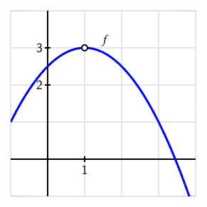
To convey the information of an image requires an understanding of what information the image is intended to convey. Two identical images can naturally have completely different descriptions depending on what the purpose of the image is. For example, consider the following image and think about how you might describe it.
The graph of a downward opening parabola labeled \(f\text{,}\) with vertex at the point \((1,3)\text{.}\) At the vertex, the graph shows an open circle, indicating that the function is not defined at this point.
The long description I gave to this image was: “The graph of a downward opening parabola labeled \(f\text{,}\) with vertex at the point \((1,3)\text{.}\) At the vertex, the graph shows an open circle, indicating that the function is not defined at this point.” This was informed by what I assumed the author was trying to accomplish with the image: to illustrate various ways that a function might not be continuous. I also know that the textbook has described parabolas as “opening downward,” rather than having negative leading coefficient or some other standard.
But what if this same image was in an exercise asking the reader to determine the equation of the parabola? The description above didn’t mention anything about axes since that wasn’t relevant to the point the author was trying to make. If the reader wanted to find the equation, then we might write a description like the following:
The graph of a function plotted on coordinate axes. Both horizontal and vertical axes range from -1 to 4. The graph appears to start at the point \((-1,1)\text{,}\) crosses the vertical axis between labeled values 2 and 3, reaches a maximum value of 3 at \(x = 1\text{,}\) and then decreases again, crossing the horizontal axis between \(x = 3\) and \(x = 4\text{.}\)
Even this might change depending on the context. Should readers be able to identify whether the graph is a polynomial or a line? Or is the goal to be able to identify what the vertical intercept is from the graph?
Along with the pedagogical context, it is also worth considering the other information that is available to the reader: some of the information in the image may be described in the surrounding text or in the caption of the image. It is not necessary to repeat this information in the description.
Once you have an understanding of what the image is meant to convey, you can start to write the description itself. The following are some general guidelines to keep in mind.
Give an overview. Before describing various elements in an image, give a brief overview. This will allow the reader to determine whether they need to continue reading the description, or jump ahead. It also orients the reader to the image and helps them understand the context of the description.
Create structure. A reader will need to piece together all the different components of an image, so anything the author can do to facilitate this is helpful. For example, work from left to right, or clockwise from the top, and say that this is what you are doing. Use the relevant structure of an image to group descriptions of related components: “A set of coordinate axes, in which the horizontal axis ranges from -10 to 10 and the vertical axis ranges from -5 to 5.”
Be clear and concise. After writing your description, read it back and look for ways to improve brevity, clarity, and structure. This needs to be done while still considering the reading level and vocabulary of the target audience. A nice resource of this is the Alt Text as Poetry website.
Leverage the reader’s specialized knowledge. Again with an understanding of your target audience, you may be able to assume they know what the graph of a particular function looks like. For example, an advanced college math textbook could have as a description, “graph of a quadratic function with a vertex at (2, 3) and a \(y\)-intercept at (0, 1).”
Avoid visual shorthand. Sighted authors are used to using comparisons between how things look. Some basic shapes should be okay for most readers: a ball, a cup, U-shaped, etc.
As an example of the structure of a description, consider the recommendations for describing a “chart or graph” (data visualization) provided by the Do No Harm Guide: Centering Accessibility in Data Visualization. Chapters 3 and 4 of that guide are particularly helpful.
A Venn diagram with two overlapping circles labeled A and B, respectively. Each circle contains a region which does not overlap with the other circle, and a region which does overlap. The region contained in circle A that does not overlap with region B is shaded.
A Venn diagram with two overlapping circles labeled A and B, respectively. Each circle contains a region which does not overlap with the other circle, and a region which does overlap. The region contained in circle A that does not overlap with region B is shaded.
The image is illustrating how Venn diagrams can be shaded to illustrate set operations. This was the forth Venn diagram in the text, as such the second sentence of the long description is likely unnecessary; readers should understand what a 2 set Venn diagram looks like.
Two ovals representing vector spaces \(U\) and \(V\) with arrows connecting points in oval \(U\) to oval \(V\text{,}\) representing the transformation \(T\text{.}\) Oval \(U\) is split into 4 roughly equal sections, each with 3 points; arrows point from each individual point to a shared, corresponding point in oval \(V\text{.}\) Each section’s points connect to a different point in oval \(V\text{,}\) which contains 6 points in total. In each section of oval \(U\text{,}\) a label appears above the first point and an expression appears to label the section.
Section 1: first point is labeled \(\mathbf{u}_1\text{,}\) section labeled with \(\mathbf{u}_1 + \mathcal{K}(T)\text{,}\) arrows point to point \(\mathbf{v}_1\) in oval \(V\text{.}\)
Section 2: first point is labeled \(\mathbf{u}_2\text{,}\) section labeled with \(T^{-1}(\mathbf{v}_2) = \mathbf{u}_2 + \mathcal{K}(T)\text{,}\) arrows point to point \(\mathbf{v}_2\) in oval \(V\text{.}\)
Section 3: first point is labeled \(\mathbf{0}_U\text{,}\) section labeled with \(T^{-1}(\mathbf{0}_V) = \mathcal{K}(T)\text{,}\) arrows point to point labeled \(\mathbf{0}_V\) in oval \(V\text{.}\)
Section 4: first point is labeled \(\mathbf{u}_3\text{,}\) section labeled with \(T^{-1}(\mathbf{v}_3)\text{,}\) arrows point to point labeled \(\mathbf{v}_3\) in oval \(V\text{.}\)
The image is contained in a section on injective linear transformations in a proof-based linear algebra textbook. The goal of the image is to illustrate the equivalence between images of the linear transformation, their pre-images, and the kernel of the transformation.
Graph with 9 vertices arranged in a circle. Edges connect pairs of vertices. Starting at the top and moving clockwise, the vertices have been numbered in this description 1 through 9 so edges can be detailed in the table below.
Graph with 9 vertices arranged in a circle. Edges connect pairs of vertices. Starting at the top and moving clockwise, the vertices have been numbered in this description 1 through 9 so edges can be detailed in the table below.
This is from an exercise in a section on paths in graphs. The question reads, “Below is a graph representing friendships between a group of students (each vertex is a student and each edge is a friendship). Is it possible for the students to sit around a round table in such a way that every student sits between two friends? What does this question have to do with paths?”
Watching a blind reader navigate a web page can be a very enlightening experience. Or you might even undertake learning one yourself. Here are some suggestions for getting started (current on 2018-05-31).
Much of the technical work for accessibility is accomplished by PreTeXt developers. But authors have responsibilities, too. So testing can be part of your workflow. One free tool is axe from Deque Systems.
We have concentrated on making HTML output accessible, since that seems the most natural and best supported. But we are aware of efforts for other formats.